Rebranding The Westwood Lounge as a local place to unwind

The Westwood Lounge had local recognition, but it needed a clearer story. We helped shape the brand into a warm, modern restaurant and lounge identity that could support a renovation, guide the guest experience, and give the business a stronger presence in Winnipeg’s Westwood neighbourhood.

Branded Westwood Lounge cocktail menu and coaster displayed on a plate with custom restaurant brand details.Westwood Lounge cocktail menu and branded coaster styled on a plate for the restaurant and pub brand identity.

Our Mission

Turn The Westwood Lounge’s local familiarity into a strong hospitality brand that could guide a renovation, the guest experience, and future growth.

Category

Restaurant, Pub & Cocktail Lounge

Location

Winnipeg, Canada
Westwood Lounge logo design shown over a subtle Winnipeg map-inspired background.

The lounge needed to become more than the restaurant next door

The Westwood Lounge had been part of Winnipeg’s St. James neighbourhood for years, but after the business was purchased by Smitty’s, a long-running Canadian family restaurant chain, its identity had started to blur.

The owners came to us with a challenge: The attached restaurant carried the Smitty’s name, but the lounge needed space to become something of its own. The St. James and Westwood neighbourhoods had plenty of casual dining options, but fewer places that lived in the space between fine dining restaurant and sports lounge. They were also beginning to plan a renovation of the space. Before the interior design could move forward, they needed a hospitality brand strategy that could guide the atmosphere, visual identity, signage, materials, menu design, and guest experience.

They saw an opportunity to create a more distinct lounge brand, one that could attract guests looking for a polished but approachable place for cocktails, casual dinners, sports nights, and easy evenings out.

“I wanted a bit of cozy.”

Amanda Ranson

Minimal Westwood Lounge deer-inspired brand icon in cream on a deep green background.Two cocktails being held inside Westwood Lounge, showing the restaurant’s cocktail lounge atmosphere.

We found the opportunity in what was already familiar

The project began with discovery, a tour of the existing lounge, and research into the local restaurant, bar, and lounge landscape.

We looked at the neighbourhood, the competition, the audience, and the relationship between The Westwood Lounge and the Smitty’s parent brand. The question was not simply what the lounge should look like. It was what role it could play in the neighbourhood.

Through our research, we identified a clear opening: a warm, local, bar-meets-upscale-lounge experience that felt more polished than a casual chain restaurant, but more relaxed than a formal cocktail bar.

“It was out-dated and didn’t have a story of its own to make it stand out and build a business around.”

Michael Leger

Vintage black and white travel photo with the Westwood Lounge brand mark overlaid.Westwood Lounge restaurant and pub logo lockup with Smitty’s endorsement and brand tagline.

We explored several naming and storytelling directions rooted in local culture, railway history, westward movement, and the idea of finding your way to a familiar place. While new names were considered, the strongest direction was the one that kept the existing Westwood name and gave it more intention.

The Westwood Lounge already held recognition in the area. Instead of walking away from that familiarity, we helped build a stronger restaurant brand around it.

The strategy centred on the idea of where Westwood unwinds.

From there, we developed the tagline Built Around Moments—a simple expression of what the lounge was really there to hold: the first drink after work, the casual dinner that stretches later than planned, the regular wing night, the quiet date, the familiar face across the table.

“It’s a cool idea. I love it.”

Amanda Ranson

Plate of wings and fries at Westwood Lounge with the cocktail lounge logo overlaid.Westwood Lounge restaurant, brunch, and cocktail menu designs layered on a warm wood background.

The brand needed to feel independent, but still work within a larger restaurant system

One of the most important strategic considerations was brand architecture.

The Westwood Lounge needed to feel like its own restaurant and cocktail lounge brand, not simply an extension of Smitty’s. At the same time, it still needed to exist within the realities of a national restaurant group and gain approval from Smitty’s head office.

That balance shaped the entire project.

The brand had to be independent enough to shift perception, local enough to connect with the neighbourhood, and practical enough for the ownership team to activate across signage, menus, merchandise, packaging, patio decisions, and future restaurant marketing.

We created a flexible brand system that could stand on its own in most applications, while still allowing the Smitty’s relationship to appear when useful. This gave the lounge room to grow into its own identity without creating unnecessary friction behind the scenes.

Custom Westwood Lounge coaster designs with logo marks, heritage imagery, and Winnipeg map details.

The identity was built from neighbourhood warmth, heritage cues, and a little evening light

The final visual identity was designed to feel warm, grounded, and nostalgic.

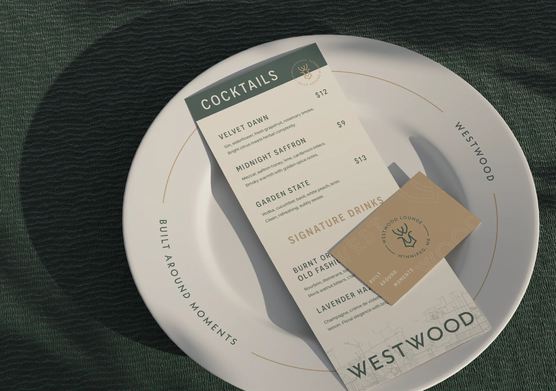
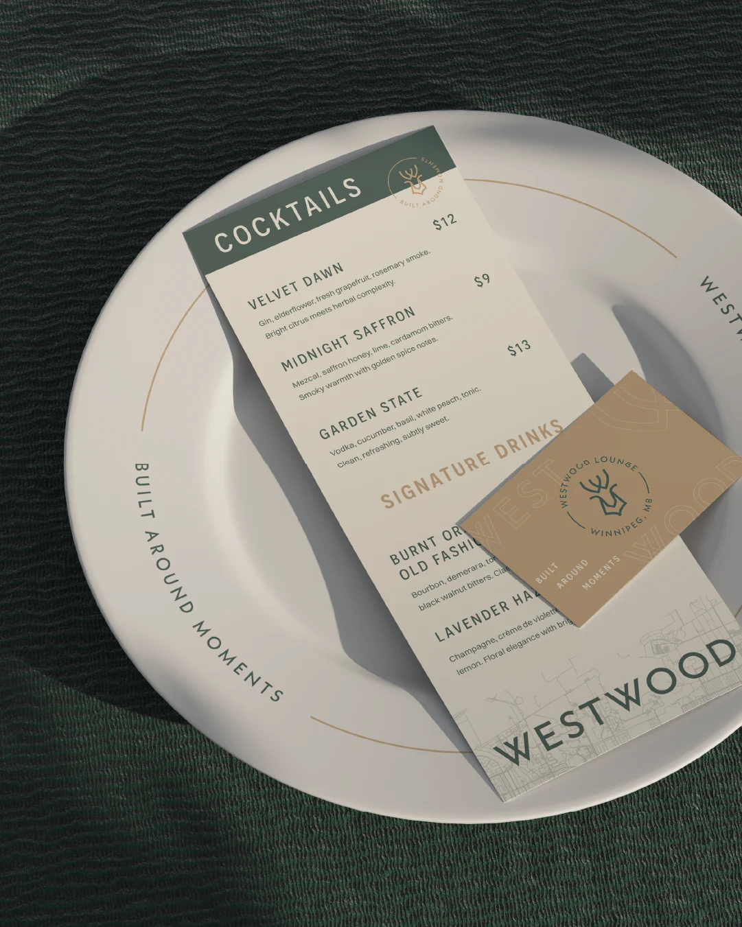
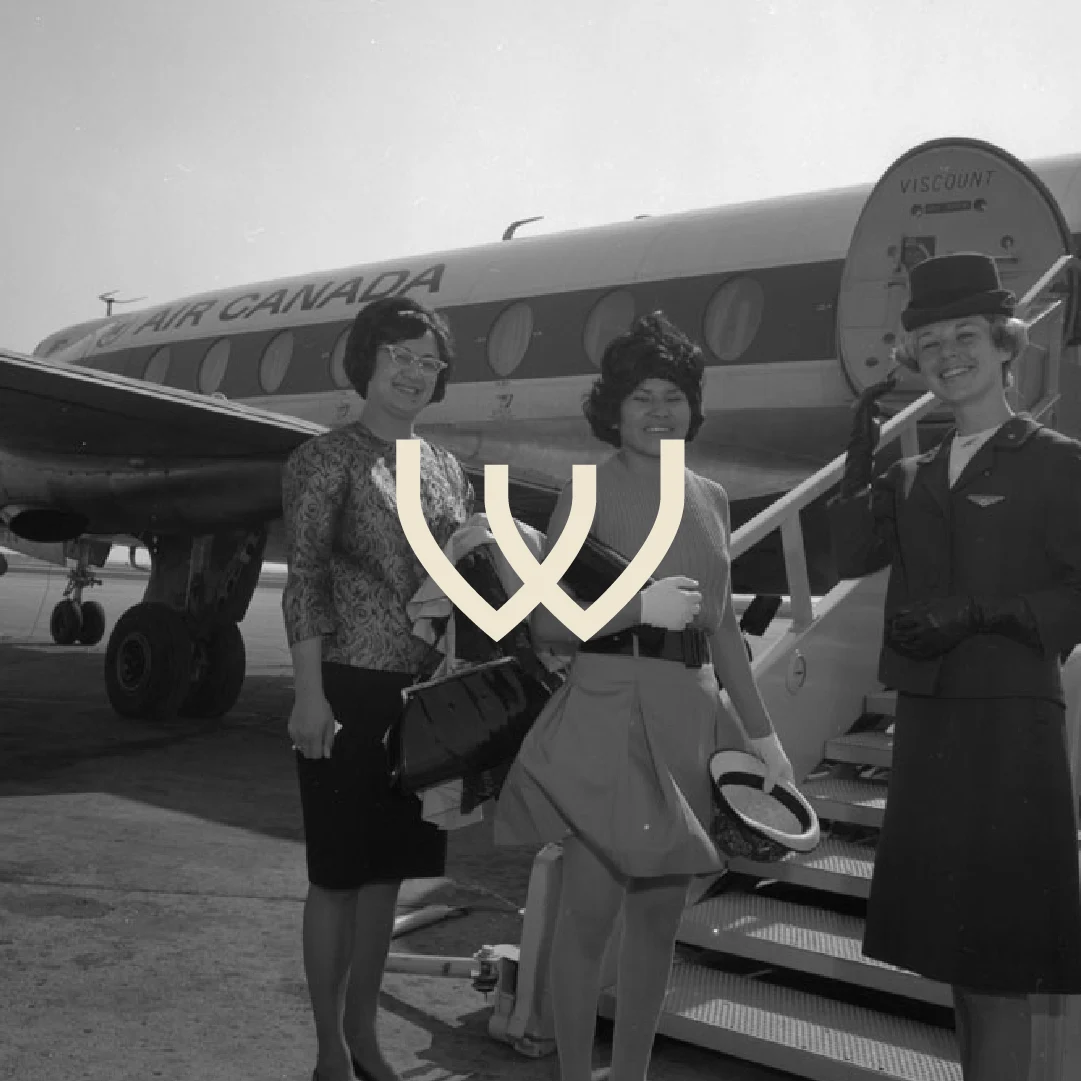
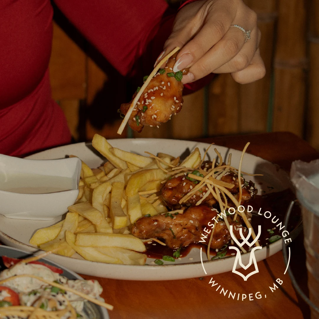
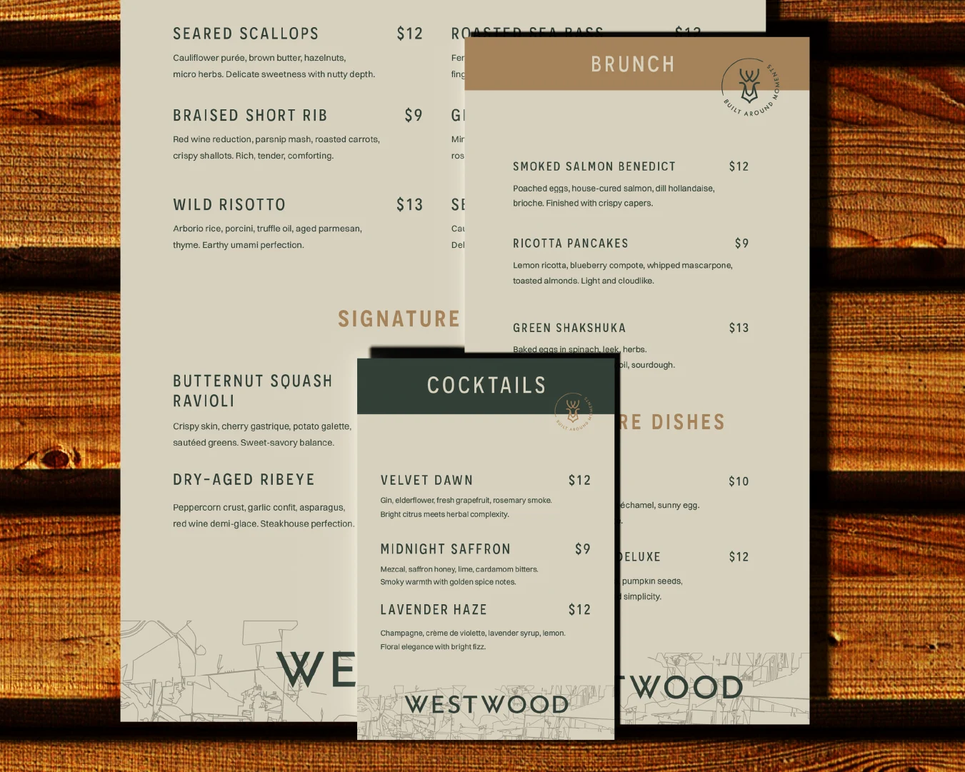
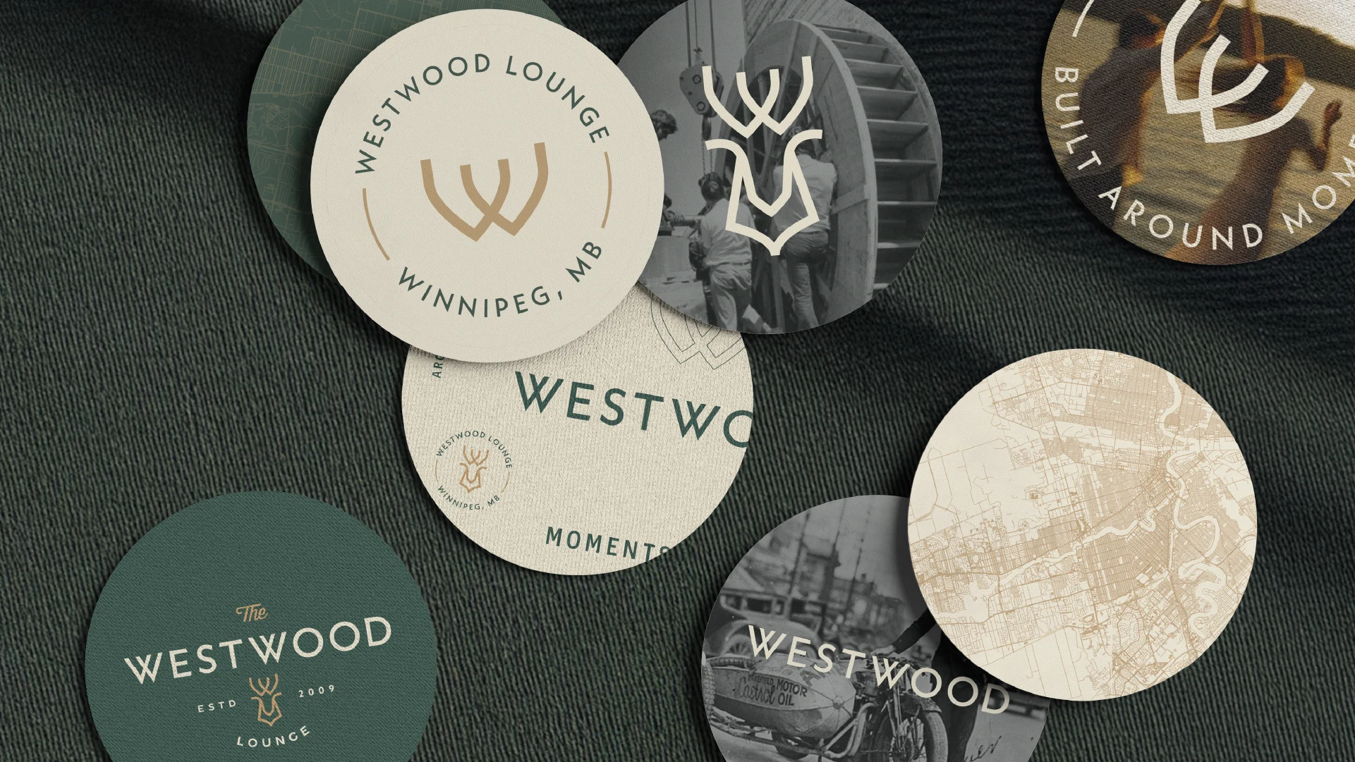
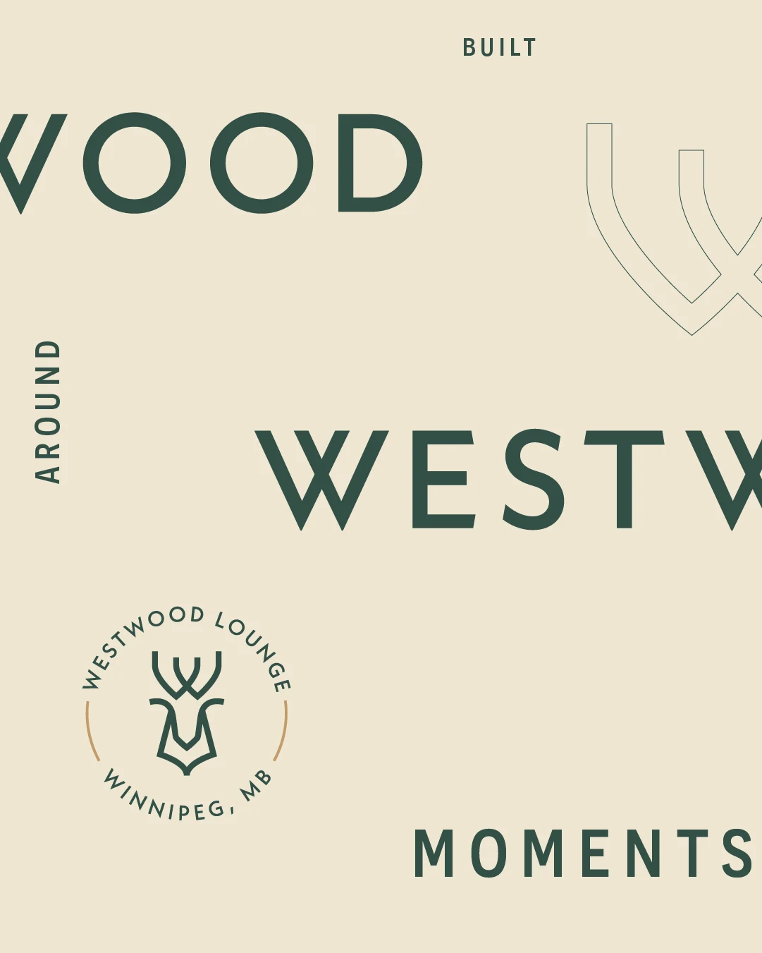
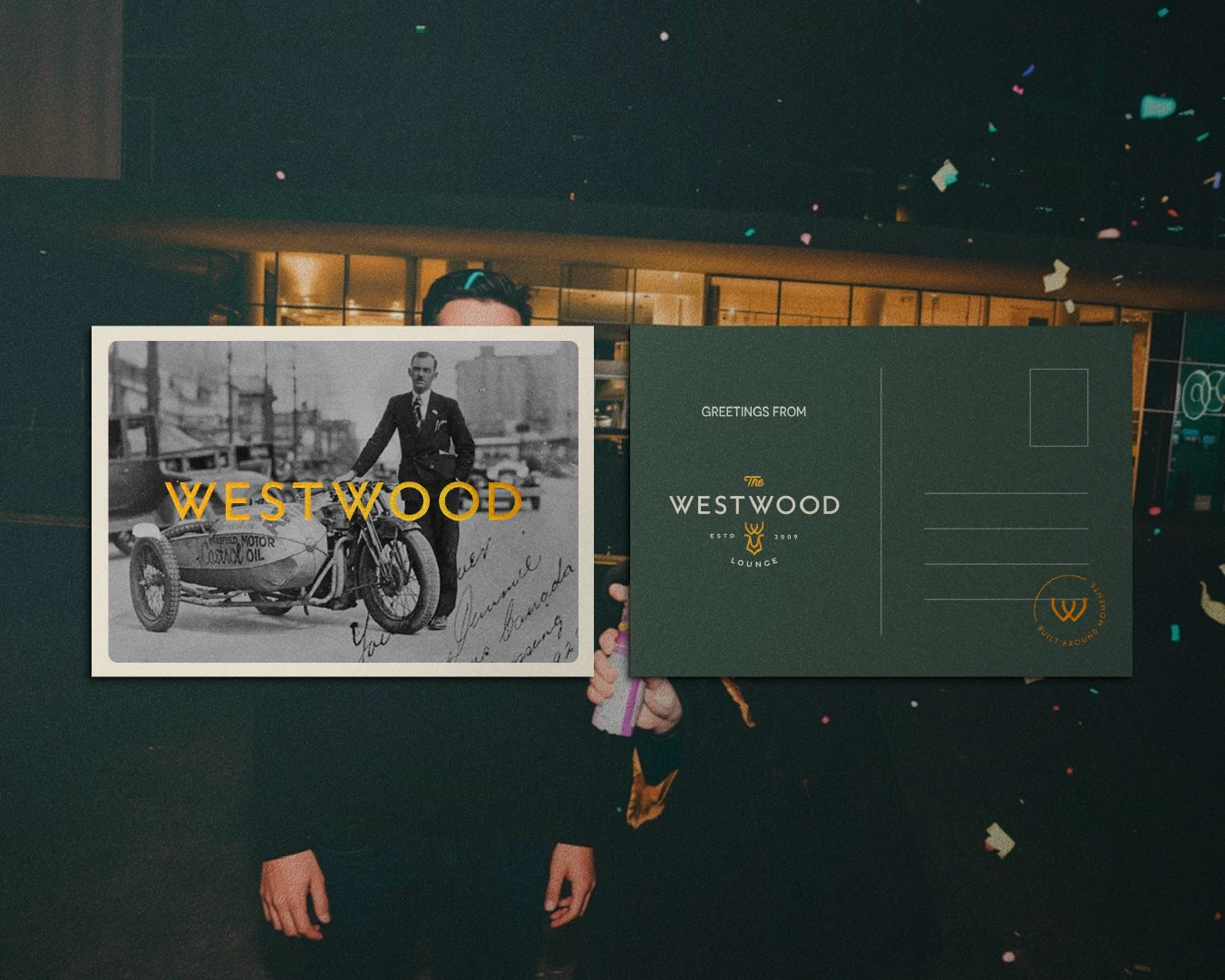
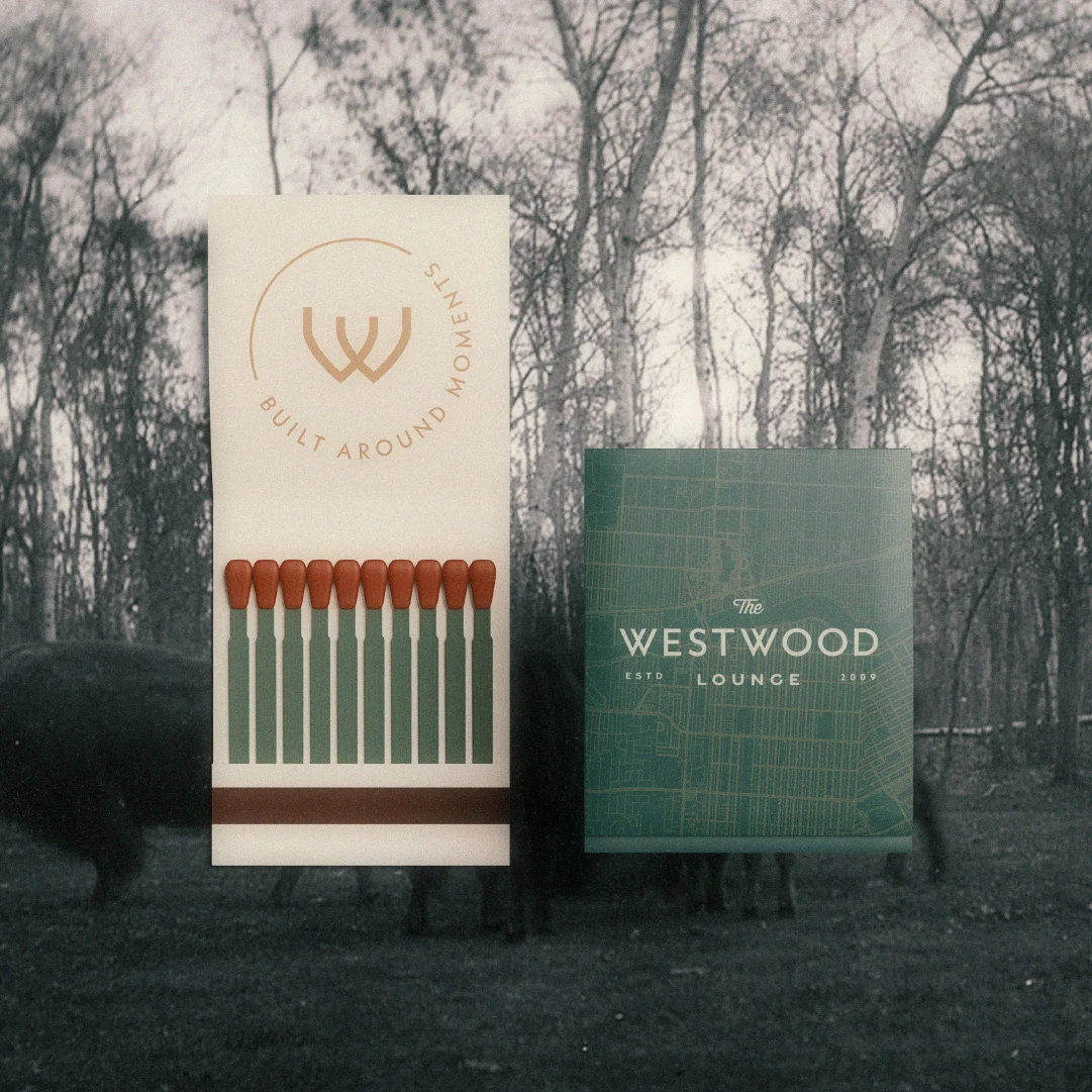
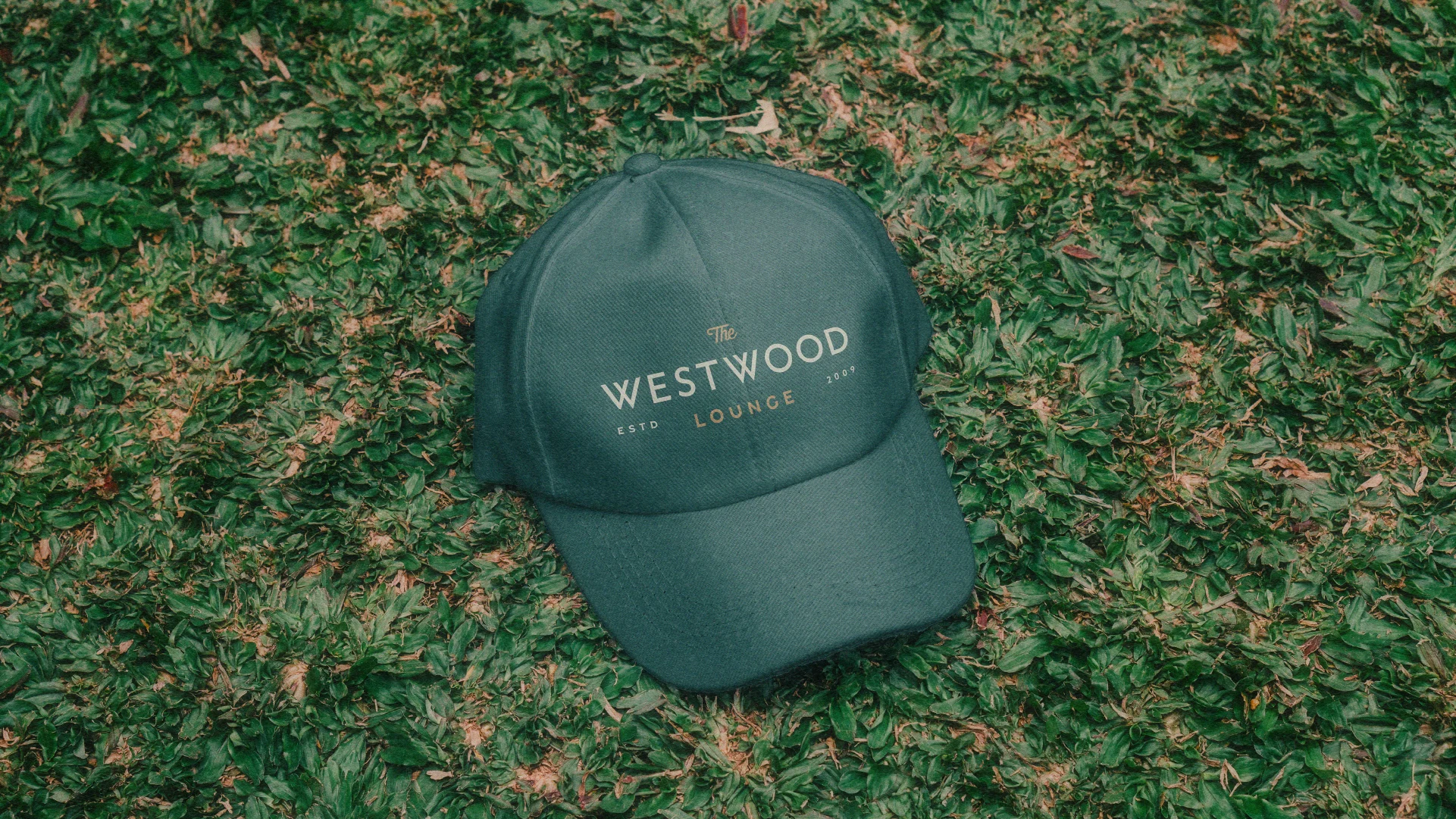
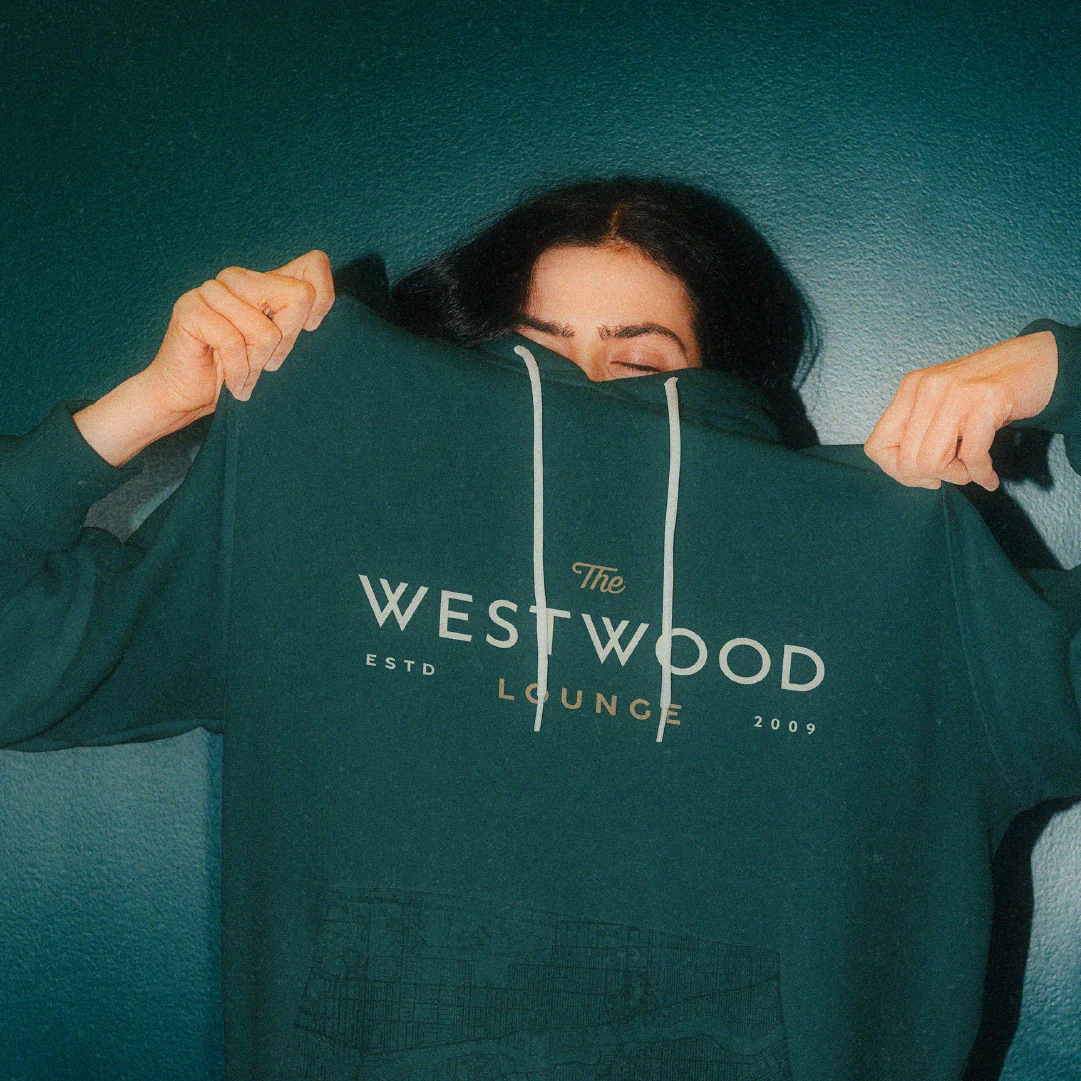
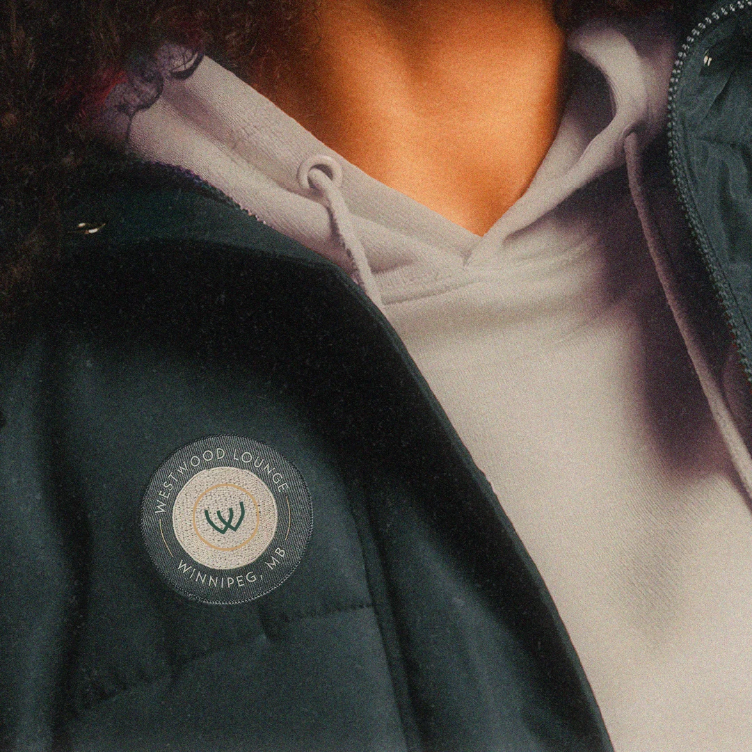
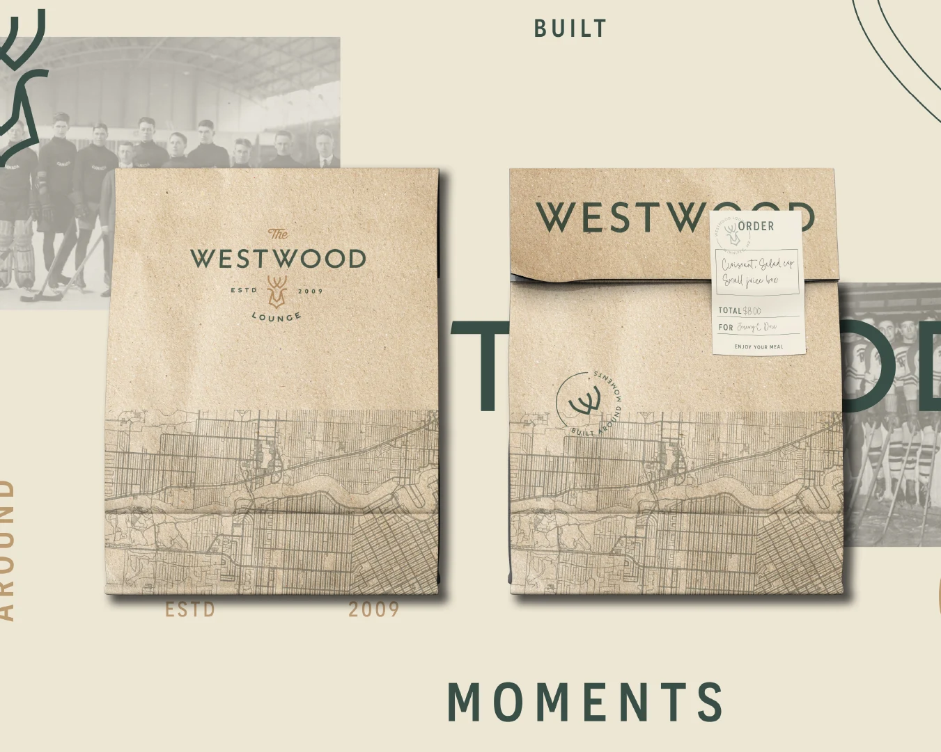
For the logo system, we drew from heritage lounge badges, local gathering places, and classic hospitality marks. The Westwood wordmark gave the restaurant brand a strong, simple foundation, while the custom W mark created a flexible symbol that could work across coasters, menus, signage, merch, social graphics, and environmental details.

We explored logomark options that connected the brand back to place and ownership, including a deer inspired by an animal commonly seen in the neighbourhood and a bison connected to Brokenhead Ojibway Nation’s bison herd. In both directions, the form connected back to the custom W mark, giving the system a sense of continuity.

The colour palette leaned into natural greens, warm beige, brown, and gold. The green gave the brand depth and familiarity. The neutrals created a grounded foundation for the restaurant interior. The gold brought in the feeling of westward evening light—that low, warm glow that settles over a neighbourhood at the end of the day.

The typography was clean, approachable, and easy to manage in-house. This was important for a restaurant and lounge brand that would need to live on menus, specials, signage, social media, staff apparel, and everyday operational materials.

Texture came through a subtle map of the St. James and Westwood area, creating a quiet connection to place. Rather than building a generic plounge brand, the identity carried the neighbourhood with it.

“Beautiful. I love the color scheme. I think it complements our Smitty’s restaurant really well.”

Michael Leger

Westwood Lounge brand graphics showing logo variations, heritage photography, and social media design assets.Close-up of Westwood Lounge brand typography, logo mark, and “Built Around Moments” messaging.

The brand system was designed to move from logo to guest experience

For a hospitality brand, the identity has to do more than look good in a presentation. It has to work at the table, on the wall, in someone’s hand, and in the memory they take with them when they leave.

We developed a visual system that could extend across the full restaurant and lounge experience, including menus, coasters, matchbooks, postcards, business cards, takeout packaging, labels, plates, aprons, merchandise, social media, and signage.

The menu system gave the cocktail lounge and restaurant offerings a more polished frame, while still feeling relaxed and readable. The coaster and matchbook concepts brought in the small tactile moments that make a lounge feel memorable. The takeout packaging showed how the identity could carry into casual dining and off-premise orders without losing its sense of place.

Westwood Lounge postcard designs using vintage photography, deep green branding, and cocktail lounge logo marks.Westwood Lounge matchbook and branded card design inspired by heritage hospitality and local Winnipeg details.

The photography direction was built around three categories: food, moments, and memories.

Food photography was intended to feel warm, candid, and shared. Moments focused on people, movement, and the lived-in feeling of a night out. Memories introduced archival and vintage-inspired imagery as a heritage layer, connecting The Westwood Lounge to Winnipeg, Westwood, and the feeling of a place with history.

Together, the system gave the client a brand identity that could support the renovation, shape the guest experience, and create a more cohesive restaurant marketing presence across every touchpoint.

“I loved everything… Colours are great. The use of it everywhere. I want to get an apron. I want a sweater, for sure.”

Michael Leger

Green Westwood Lounge branded hat displayed on grass as part of the restaurant and pub merchandise system.

The final brand gave the owners a clearer story to build around

The final direction was well received by ownership and approved by Smitty’s head office, allowing the project to move forward smoothly.

That approval mattered. The brand needed to feel distinct and locally rooted, while still working within a broader restaurant group. The final identity created that bridge.

More importantly, it gave the owners a clearer creative framework for the next phase of the business. Instead of approaching the renovation, patio, signage, materials, menu design, and merchandise as separate decisions, they now had one cohesive brand lens to work through.

Westwood Lounge hoodie design featuring the restaurant’s logo system in cream and gold on deep green fabric.Close-up of a Westwood Lounge branded patch on apparel with circular logo and Winnipeg location detail.

The identity helped the team understand what The Westwood Lounge represented, who it was for, and how it could stand apart in the neighbourhood. It also gave the interior design team a stronger foundation for the physical space, from colour and material direction to the overall feeling of warmth and ease.

After the brand project, the owners continued working with Little Ghost on signage design, carrying the identity from strategy and visuals into the built environment.

“The process of getting to the final logo, brand, gives us the information to really buy into what the business represents.”

Michael Leger

Westwood Lounge takeout packaging design with custom logo, order label, and Winnipeg map-inspired illustration.Guest smiling while dining at Westwood Lounge with food and drinks in the restaurant interior.

The Westwood Lounge is now built around the moments people stay for

The Westwood Lounge began as a familiar local spot in need of a clearer identity.

Through brand naming exploration, restaurant brand strategy, visual identity, and hospitality-focused brand applications, we helped turn that familiarity into a stronger story — one rooted in neighbourhood warmth, easy evenings, shared tables, and the simple pleasure of having a good place nearby.

The result is a restaurant and cocktail lounge brand that feels independent, local, and ready to grow.

A little more polished. Still easy to walk into.

Built around moments.

“If you want a complete brand package, they produce excellent work and give you the tools to properly brand your business.”

Michael Leger

Smitty’s Westwood Lounge logo lockup for the Winnipeg restaurant, pub, and cocktail lounge brand.

Project Services

Brand Naming · Brand Strategy · Visual Identity · Sigage

The Project team

  • Robyn Kacperski — Brand Director
  • Riley Chervinski — Naming & Strategy
  • David Mas Parres — Visual Identity
Two cocktails being raised on the Westwood Lounge patio with the restaurant’s brand icon overlaid.
Cropped view of a teal Reyou Mindfulness business card on rock, featuring the white icon and “reyou” wordmark.Teal business card for Reyou Mindfulness with a white icon and “reyou” wordmark, resting on a lichen-covered rock in dappled light.
Retreats & Wellness Experiences

Reyou Mindfulness

How we rebranded an inclusive mindfulness retreat where people step out of overwhelm, reconnect with themselves, and return to daily life with clarity, ease, and grounded strength.