Branding a Kenora resort for cabin stays, fishing trips, and weddings

How we repositioned Perch Bay as a quietly special Kenora destination, building a brand system and website that could support outdoor adventure, weddings, and year-round stays without losing its down-to-earth character.

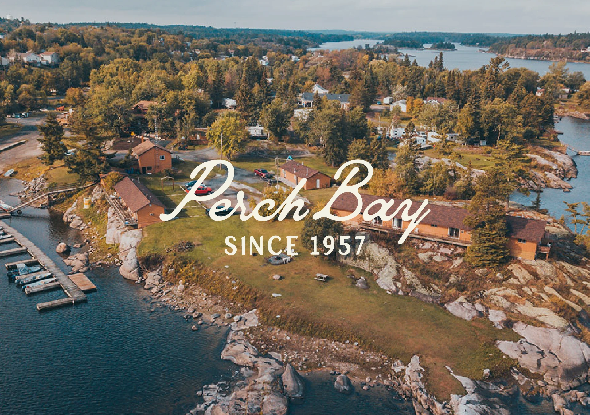
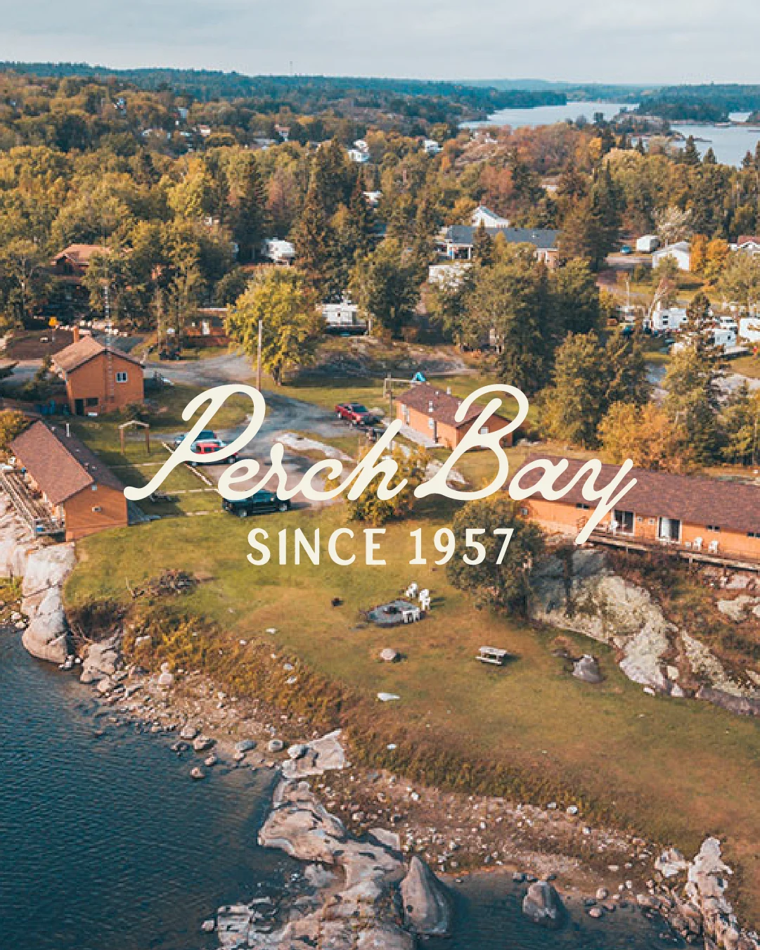
Aerial view of Perch Bay Resort’s waterfront cabins and rocky shoreline in Northern Ontario, with the Perch Bay Since 1957 logo.Aerial view of Perch Bay Resort’s waterfront cabins and rocky shoreline in Northern Ontario, with the Perch Bay Since 1957 logo.

Our Mission

Transform Perch Bay from a multi-offering resort brand into a clear, scalable tourism brand system that could support cabin stays, fishing trips, and weddings, without losing its heart.

Category

Accommodation & Adventure Tourism

Location

Kenora, Canada
Oversized Perch Bay script wordmark extending across a deep green brand background.

A place with more than one story to tell

Perch Bay is a family-run resort and event lodge on the Winnipeg River just outside Kenora.

Since 1957, it has welcomed fishing groups, families, wedding guests, snowmobilers, and outdoor travellers. Over the years, the business expanded naturally, but the brand struggled to keep pace.

The challenge wasn't a lack of character. Perch Bay had loyal guests, a rich history, beautiful photography, and a wide range of experiences. The problem was that every audience was being asked to navigate the same brand, the same website, and the same message.

Fishing guests, families, snowmobilers, wedding couples, retreat planners, and local event hosts were all arriving with different needs, and the existing brand had to work too hard to speak to all of them at once.

Our job was to make the story clearer without making the place feel complicated.

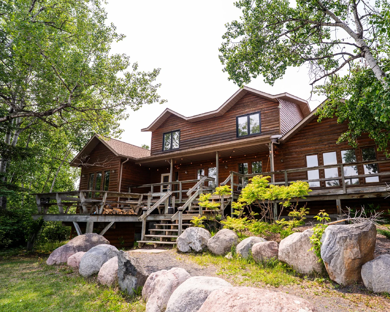
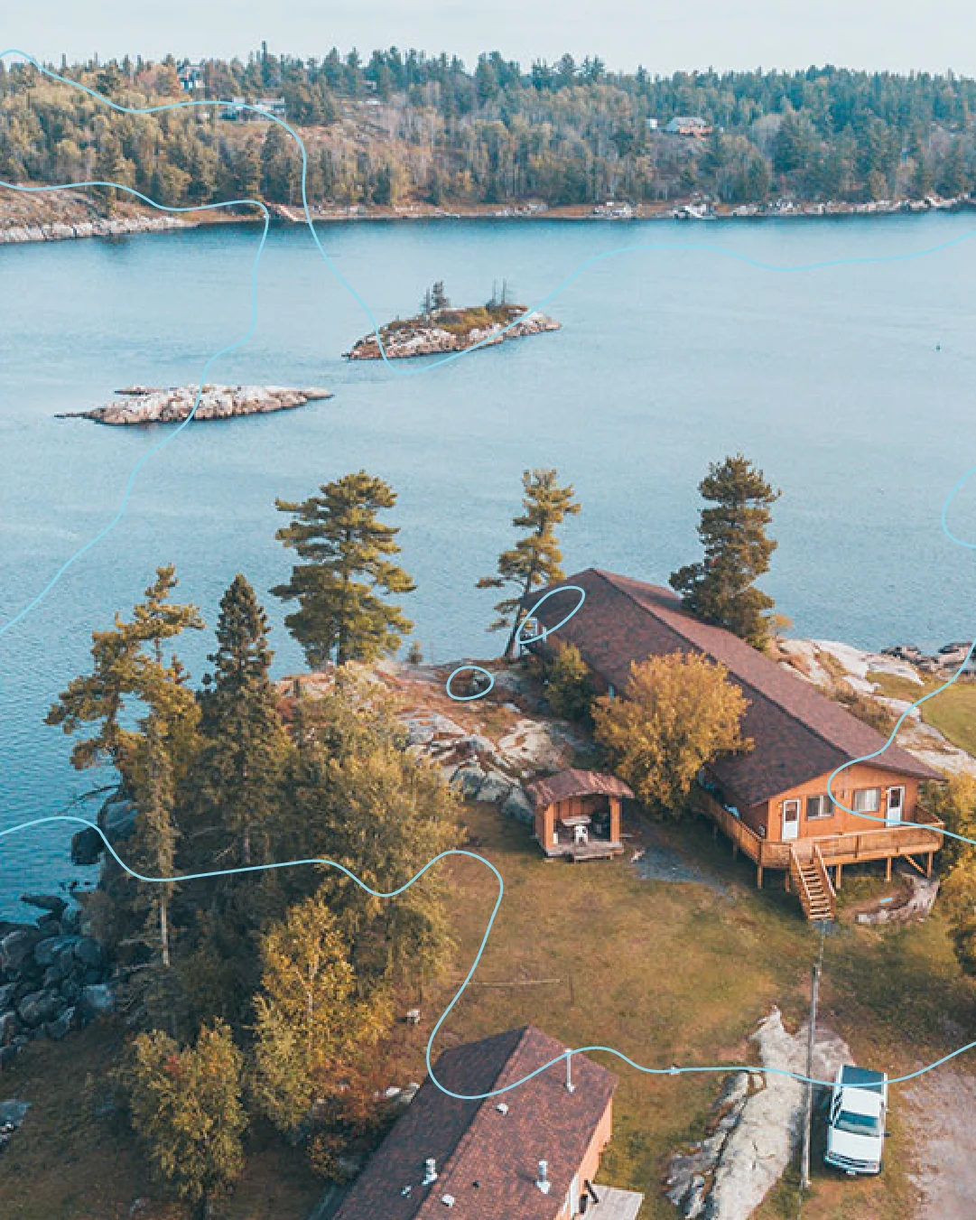
Exterior of The Lodge at Perch Bay, a rustic log wedding and events venue surrounded by trees and granite boulders.Aerial view of Perch Bay Resort cabins along the rocky waterfront, overlaid with pale blue lines inspired by the Winnipeg River.

The challenge was turning the location into an advantage

Lake of the Woods dominates much of the tourism conversation around Kenora. Many of the region's best-known fishing resorts, cabin destinations, and wedding venues have built their reputation around being directly on the lake.

Perch Bay sits somewhere different: on the Winnipeg River, close to Kenora, but away from the busier lake traffic.

Rather than competing with Lake of the Woods, we positioned Perch Bay around what made it different: quieter water, easier access, exceptional fishing, and a slower pace. The strategy shifted the conversation from "not on Lake of the Woods" to "exactly where you want to be."

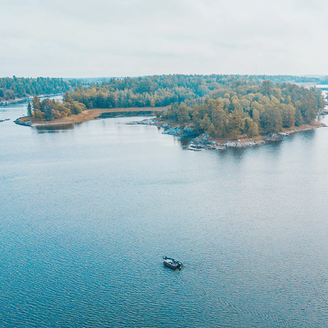
Cream Perch Bay Resort script logo centred on a deep green background.A small boat on the calm water near forested islands in Northern Ontario at Perch Bay Resort.

One brand could not speak to every guest the same way

Perch Bay served two very different audiences.

The resort needed to appeal to fishing groups, families, hunters, snowmobilers, and outdoor travellers, while the lodge needed to attract wedding couples, retreat planners, event hosts, and local communities.

Each group arrived looking for something different. Fishing guests wanted practical information about cabins, docks, amenities, and life on the water. Wedding clients wanted to picture the setting, the atmosphere, and how their celebration would feel. Trying to speak to both audiences through one message was creating friction.

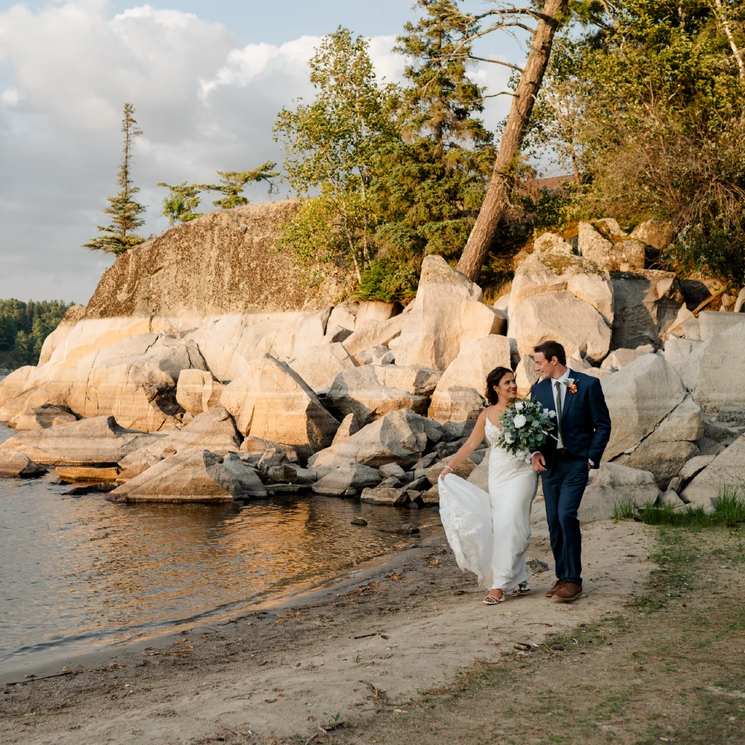
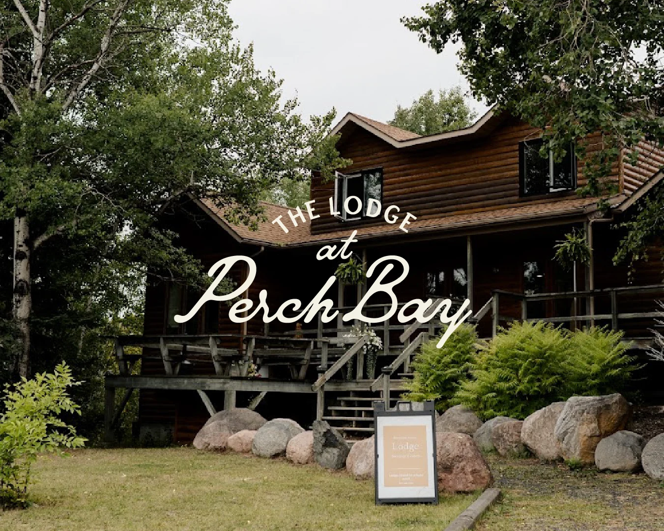
Newly married couple walking along the rocky waterfront at The Lodge at Perch Bay wedding venue in Northern Ontario.Exterior of The Lodge at Perch Bay, a rustic waterfront wedding and events venue near Kenora, Ontario, with the venue logo overlaid.

The solution was a clearer brand architecture. Perch Bay became the parent brand, rooted in family history, Northern Ontario hospitality, and the quieter rhythm of the Winnipeg River. Beneath it, Perch Bay Resort focused on outdoor adventure and cabin stays, while The Lodge at Perch Bay became the home for weddings, retreats, and celebrations.

As part of this strategy, we also recommended renaming the venue from Perch Bay Lodge to The Lodge at Perch Bay. The new name felt more like a destination than a building, giving the venue a warmer, more memorable identity while strengthening its connection to the parent brand.

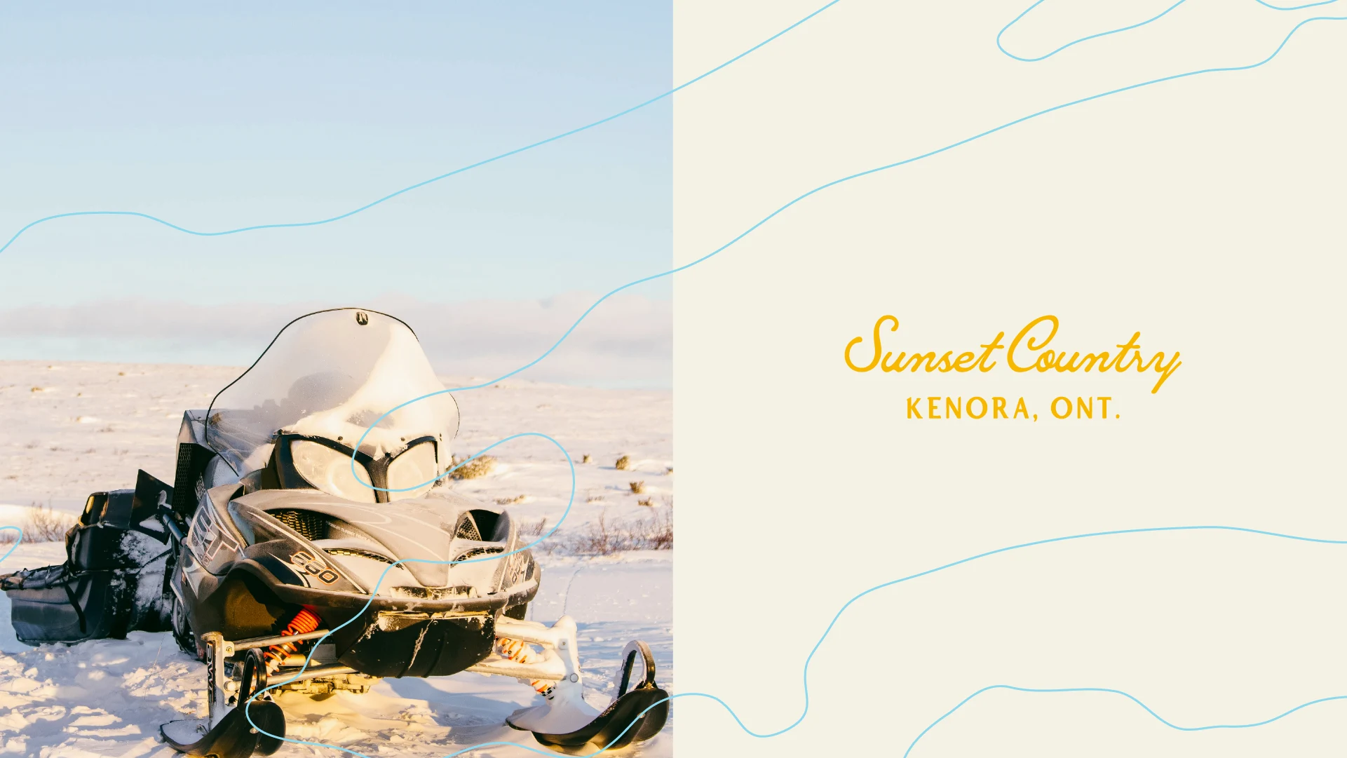
Snowmobile parked on a snowy landscape beside a branded graphic reading “Sunset Country, Kenora, Ont.”

The story was already there, it just needed more room

Perch Bay had a story most tourism brands would love to have.

It began with two cabins and a minnow bucket, shaped by bush pilots Mona and Julius and three generations of hands-on family stewardship. Over time, cabins were added, docks were restored, and a weathered airplane hangar became a warm, light-filled lodge.

The property's local roots, female-led leadership, and deep connection to the community gave it a sense of authenticity the existing brand never fully captured. Our strategy brought those stories to the forefront, helping guests understand not only what Perch Bay offers, but what makes it feel different.

Perch Bay was never trying to be the most luxurious or high-profile destination in Kenora. It offered something quieter: rustic charm, genuine hospitality, and a place where people reconnect with nature, each other, and the stories they take home.

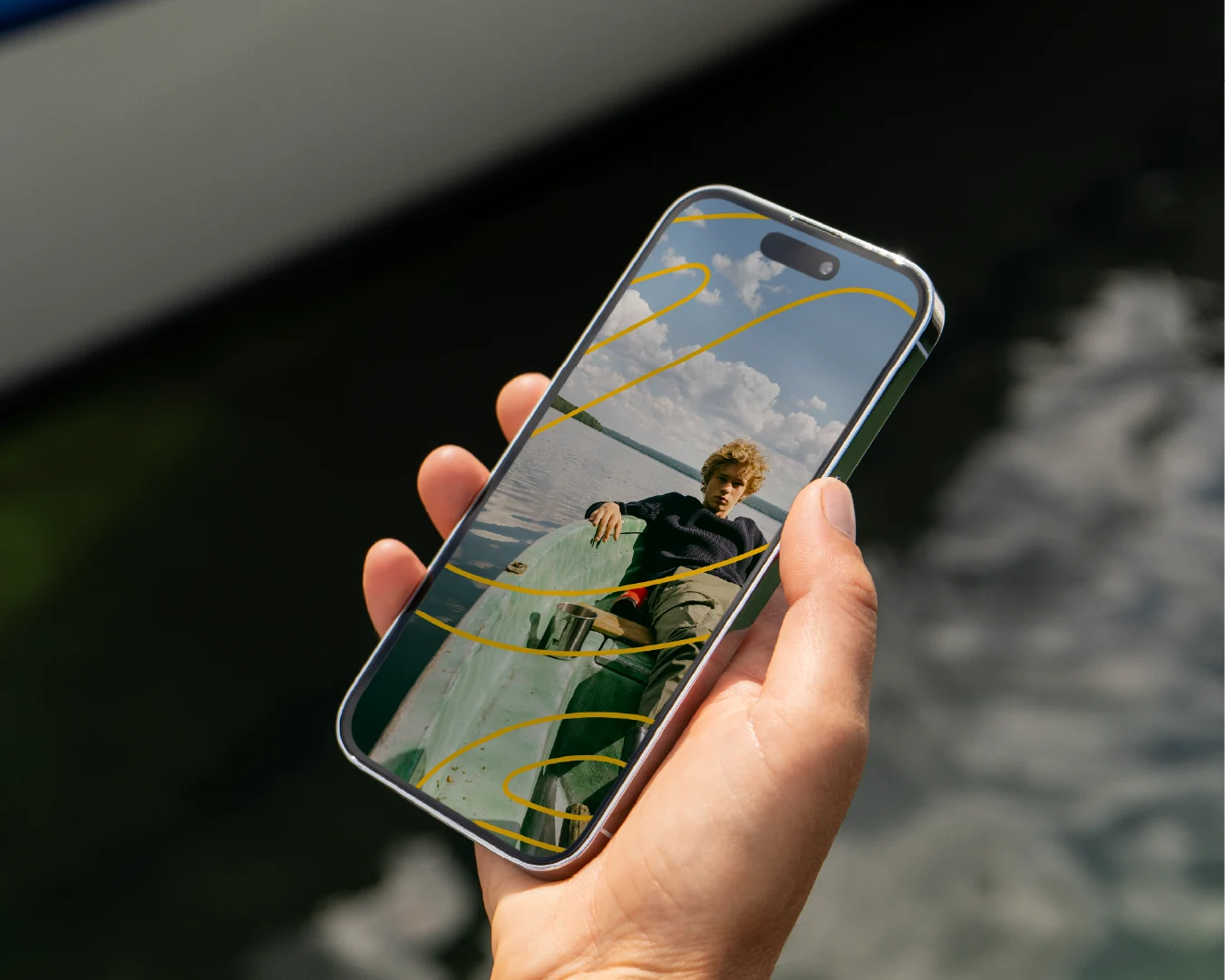
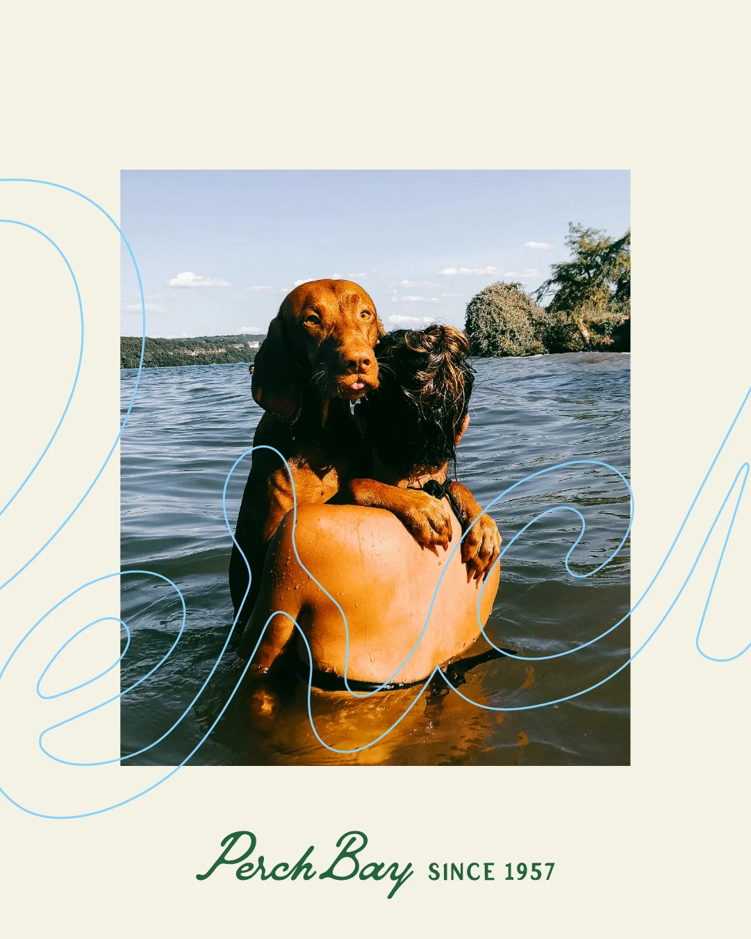
Hand holding a smartphone displaying a young person relaxing in a boat, accented with yellow Perch Bay brand graphics.A wet dog perched on a swimmer’s shoulders in the lake, framed with blue brand graphics and the Perch Bay Since 1957 logo.

The visual identity needed to feel like the river

The visual identity was designed to reflect the slower rhythm of the Winnipeg River: warm, grounded, and quietly welcoming. A flowing script wordmark gives the brand a sense of movement and heritage, while a clean supporting type system keeps it practical across everyday communications.

The identity expands into two connected sub-brands. Perch Bay Resort uses a more earthy, adventure-focused palette, while The Lodge at Perch Bay introduces softer colours suited to weddings and events. Together, they create distinct experiences while remaining part of the same brand.

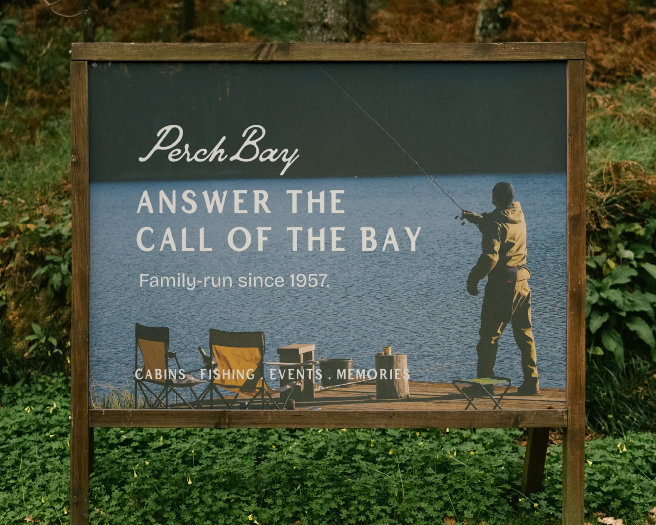
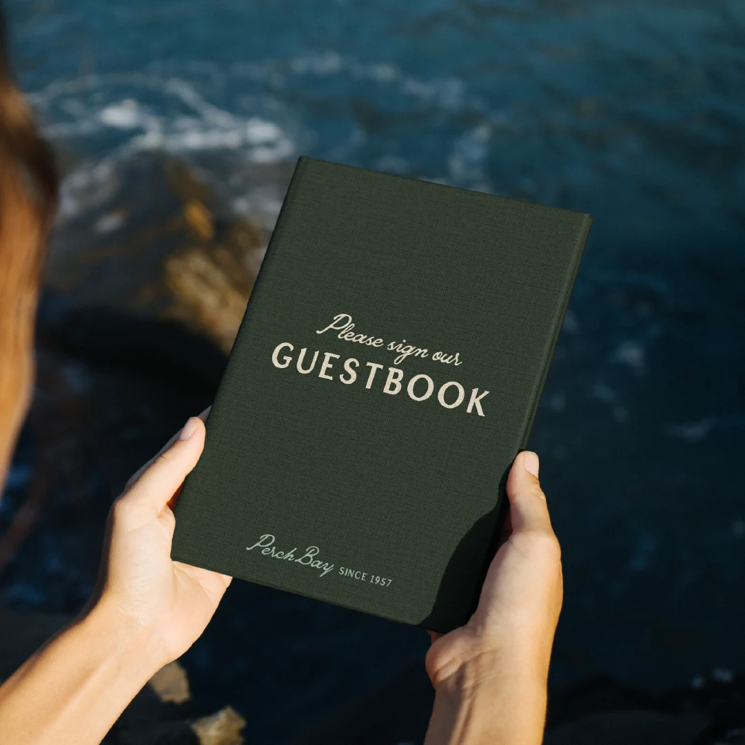
Outdoor Perch Bay Resort sign featuring a person fishing from a dock and the message “Answer the Call of the Bay.”Person holding a dark green Perch Bay guestbook beside the rocky waterfront.

Graphic elements inspired by the curves of the Winnipeg River reinforce that connection to place. Organic shapes, subtle linework, and wayfinding details create a visual system that extends naturally across signage, print materials, maps, and digital touchpoints.

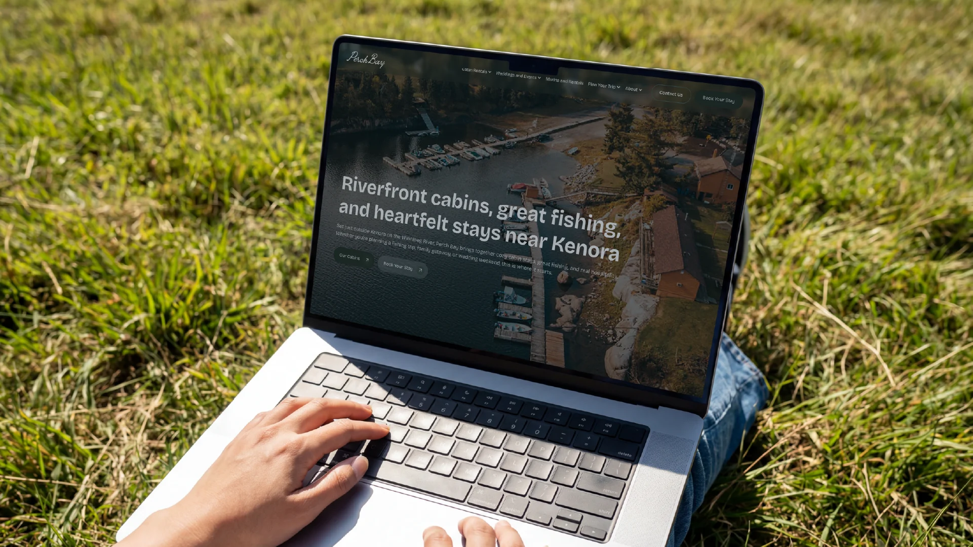
Perch Bay Resort website displayed on a laptop outdoors, featuring riverfront cabins, fishing and stays near Kenora.

The website became a path for guests booking cabin stays

The website created separate journeys for resort guests and event clients, making it easier for visitors to find the information relevant to them. It also gave the owners a more flexible Webflow platform, allowing them to manage content, photography, and future updates without relying on developers.

Green Perch Bay Resort Kenora, Ontario wordmark centred on a cream background.Navy The Lodge at Perch Bay logo centred on a pale blue background.

A clearer brand for a quietly special destination

The finished brand system gives Perch Bay room to grow without losing what has always made it special. Fishing guests, wedding couples, families, and retreat groups each have a clearer path through the brand while remaining connected under one story.

More than a new identity, the project created a foundation for future marketing, signage, merchandise, guest communications, and digital growth.

Perch Bay was always special. The brand now makes that easier to see.

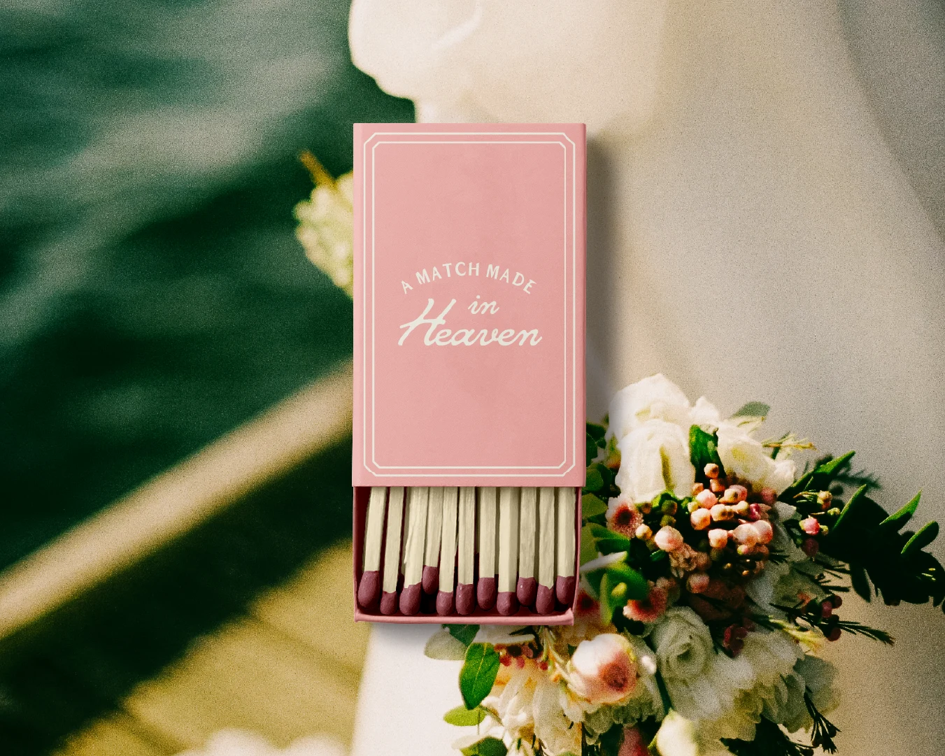
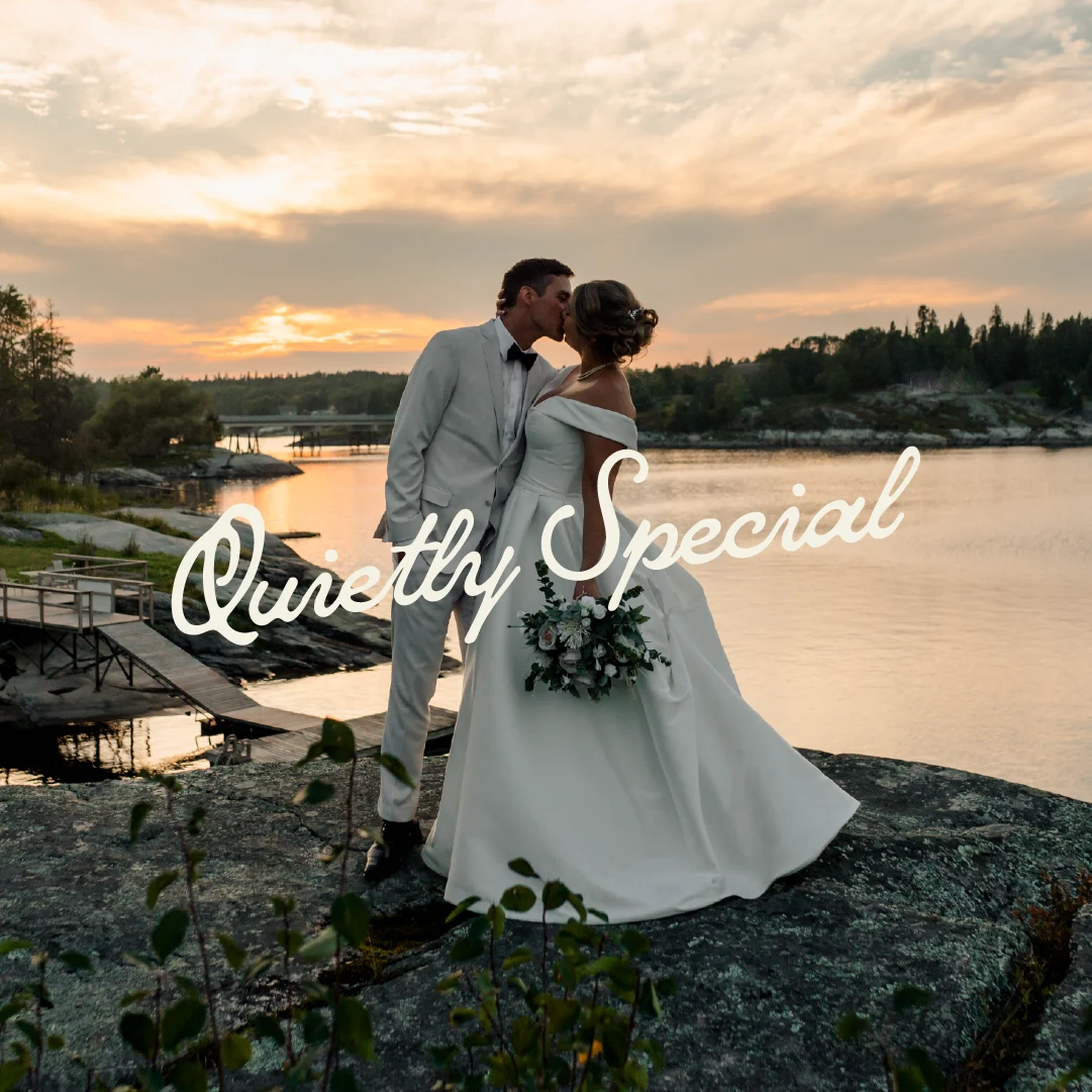
Pink wedding matchbox reading “A Match Made in Heaven” displayed on a floral arrangement for The Lodge at Perch Bay.Newly married couple kissing on the rocky waterfront at sunset at The Lodge at Perch Bay, with the words “Quietly Special” overlaid.

If your tourism business has outgrown its brand, we're here to help.

We work with resorts, lodges, destinations, and tourism operators to clarify what makes them different, then build the strategy, identity, and website to bring that story to life.

Whether you're attracting new guests, expanding your offerings, or repositioning your destination, we'll help you create a brand people remember.

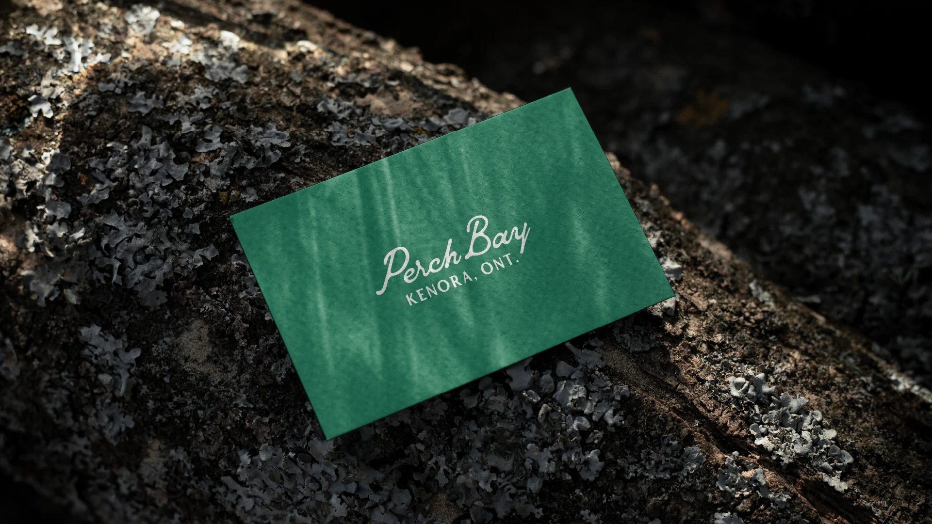
Green Perch Bay Kenora, Ontario business card displayed on a lichen-covered rock, showcasing the resort’s visual identity.

Project Services

Brand Strategy · Naming Recommendations · Visual Identity System · Brand Guidelines · Marketing Document Design · Website

The Project team

  • Robyn Kacperski — Brand Director & Strategy
  • Kyle Doucette — Visual Identity
  • Chad Evans — Web Development

Photography has been generously provided by Perch Bay Resort.

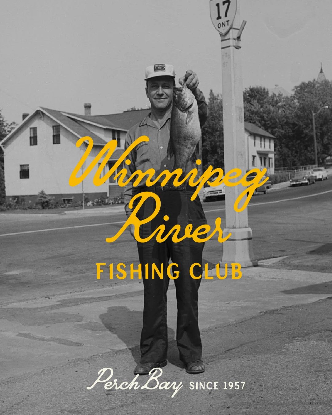
Archival black-and-white photograph of a fisherman holding his catch near Ontario Highway 17, overlaid with Winnipeg River Fishing Club and Perch Bay Since 1957 branding.
Round exterior blade sign for The Elswood in Winnipeg, showing the Elswood logo and name in white on a dark background, mounted to a building facade.
Urban Community

The Elswood

How we helped revive a lost piece of Winnipeg’s history to name a new kind of urban sanctuary, led by Brokenhead Ojibway Nation.