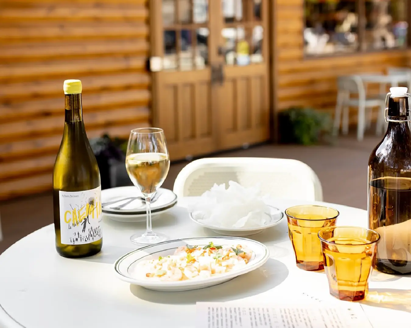
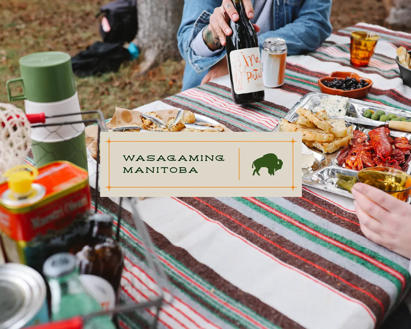
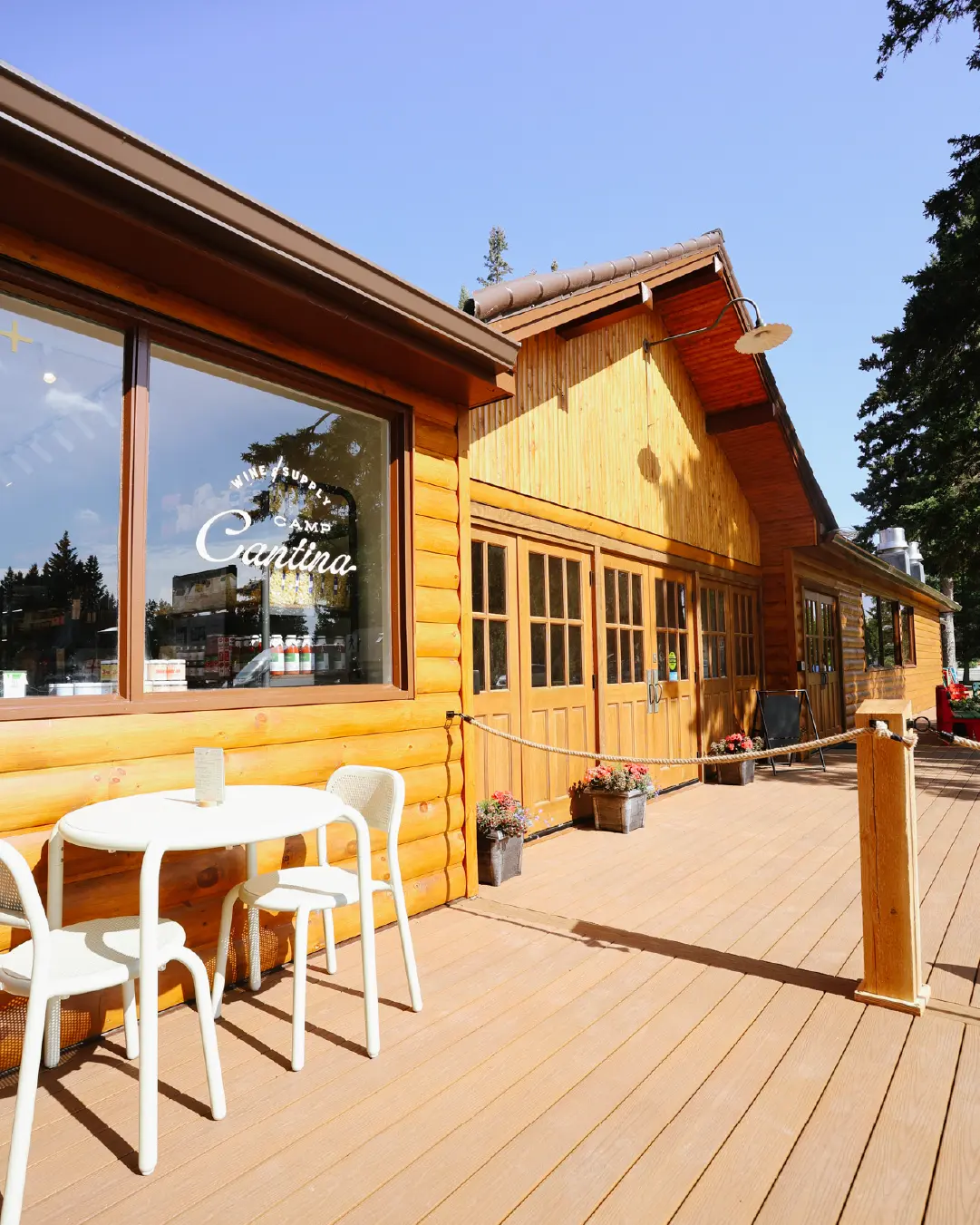
A wine bar, provisions shop, and a place for long, golden-hour evenings on the patio.
Camp Cantina was designed to be many things at once, and Megan needed a visual identity that could stretch across all of that without losing focus.
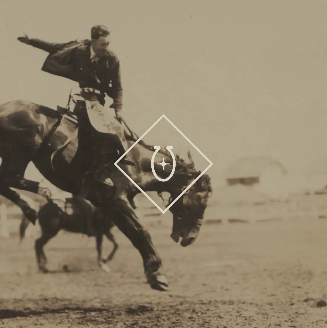
UpHouse had named Camp Cantina and shaped the strategic foundation before bringing in Little Ghost to do what we do best: deep, research-driven storytelling. A visual language anchored in place, history, and the way a spot actually feels to locals and visitors.
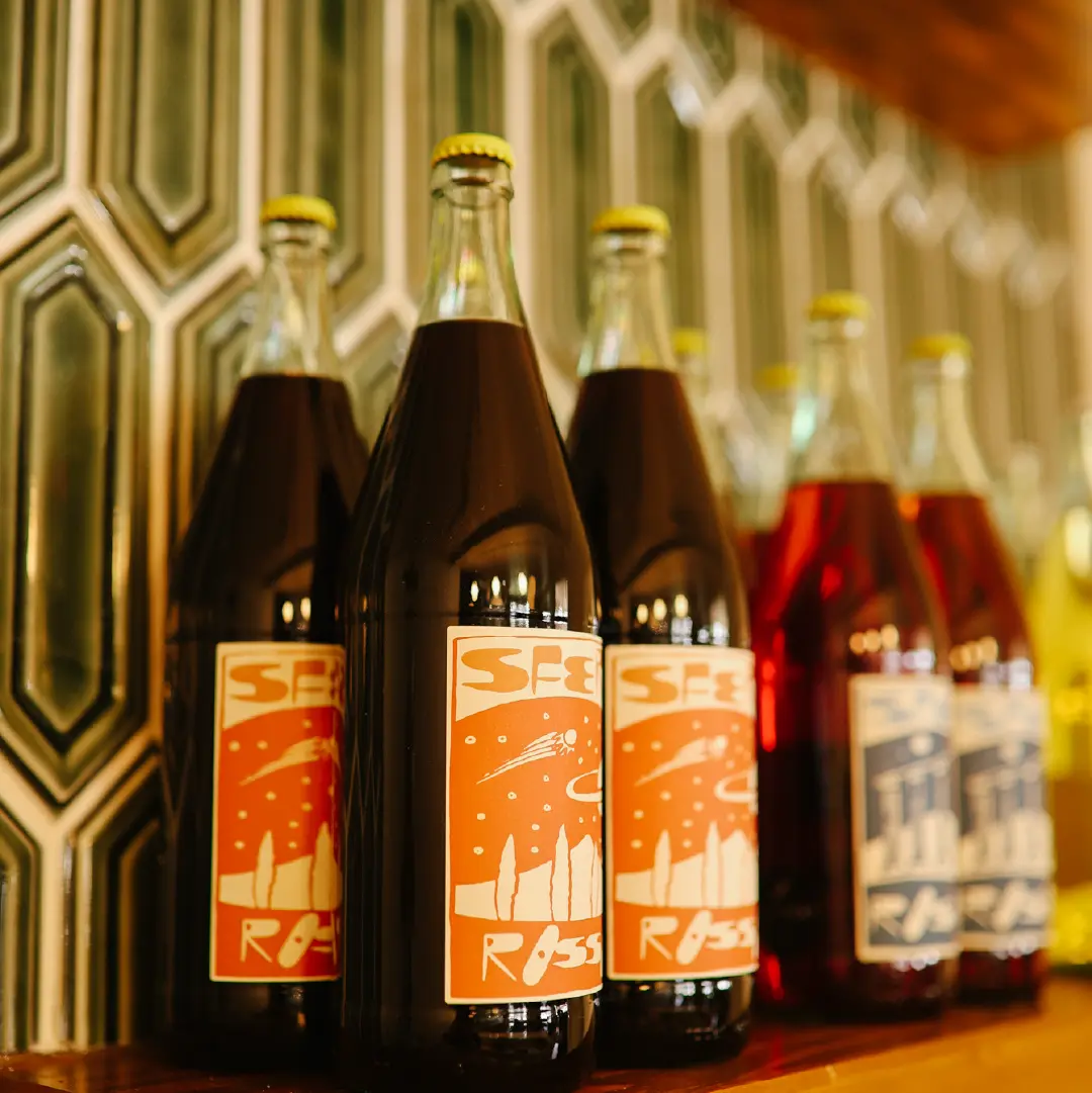
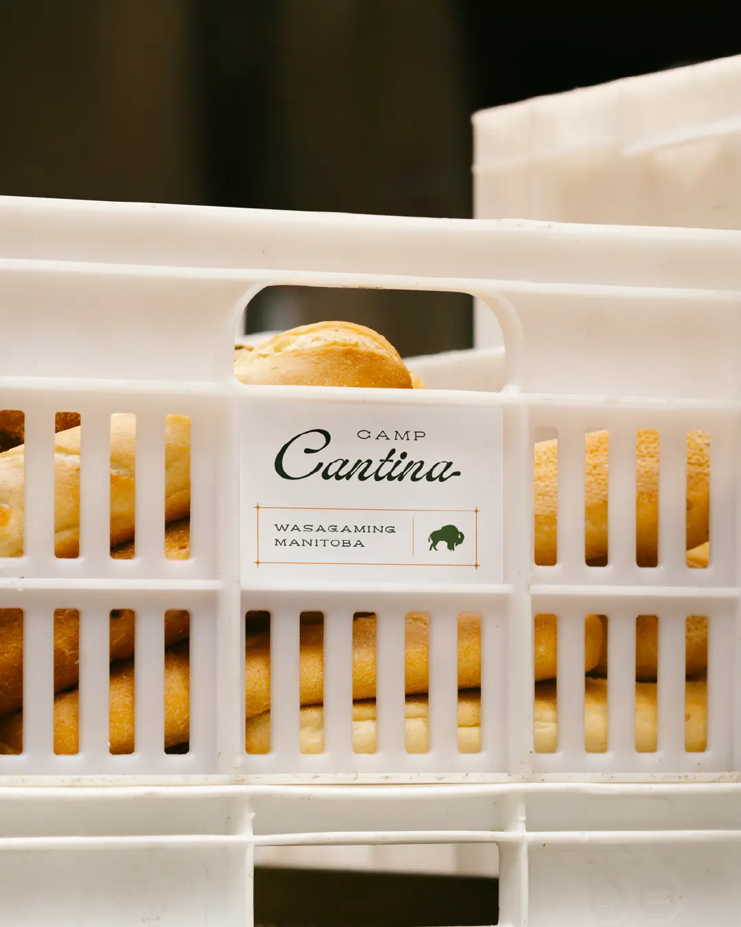
The client’s moodboard told part of the story, full of tile, bar layouts, wood textures, and cozy lamps. What it did not do was tie those details together in a clear direction for the logo, typography, and system that would have to live on menus, packaging, social posts, and future events.
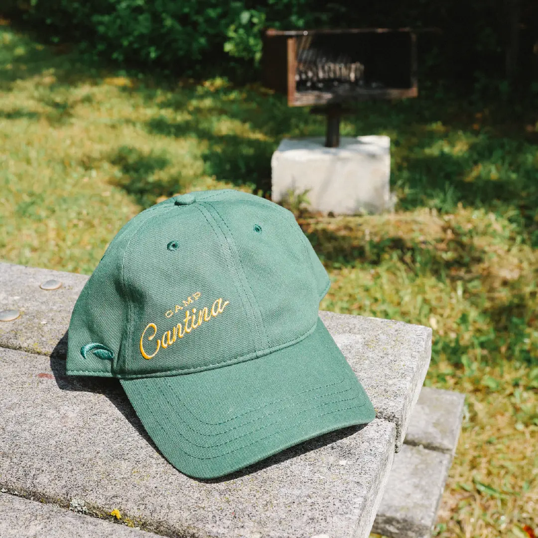
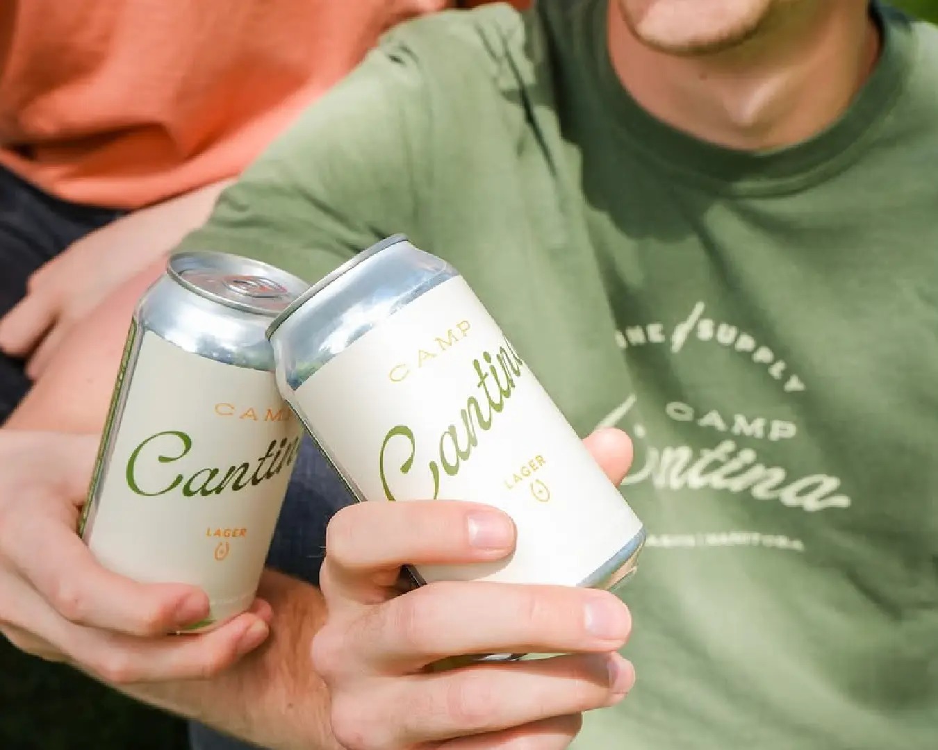
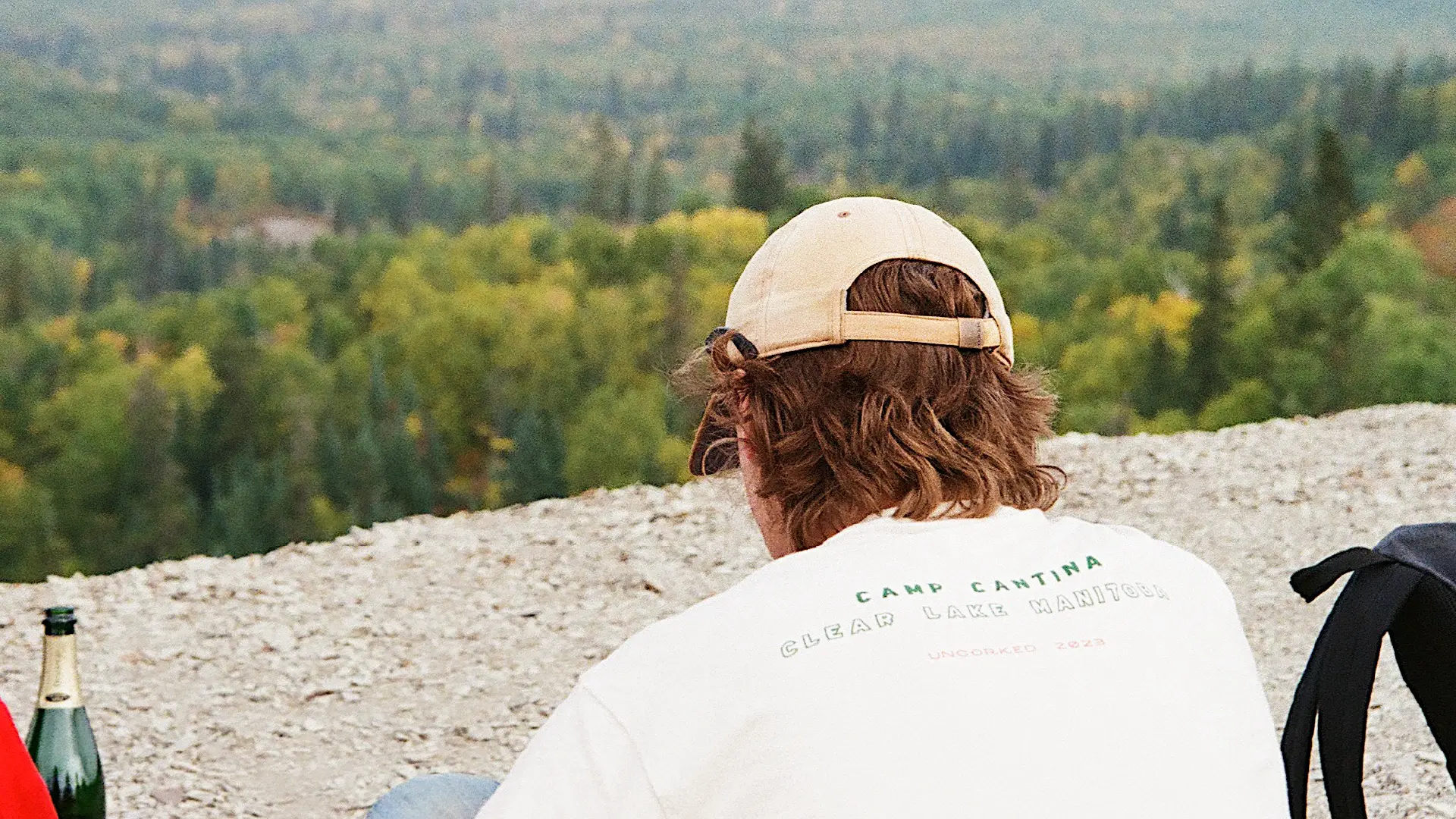
Camp Cantina needed a nostalgic but elevated identity that could work as a wine bar, a deli, and a destination worth the drive.