The Forks
Brand Audit and Strategic Roadmap for Winnipeg’s Top Cultural Destination
Bringing order to decades of brand growth without losing the character and cultural richness that makes The Forks unique.
Bringing order to decades of brand growth without losing the character and cultural richness that makes The Forks unique.

Our Mission
Category
Location
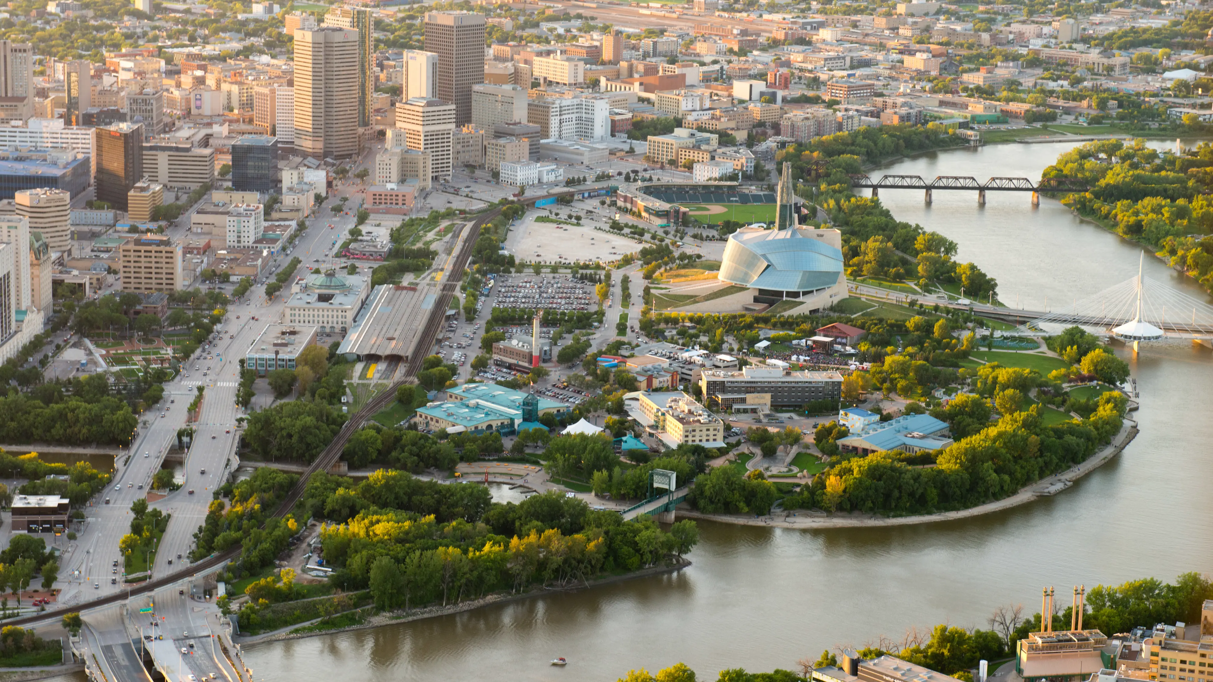
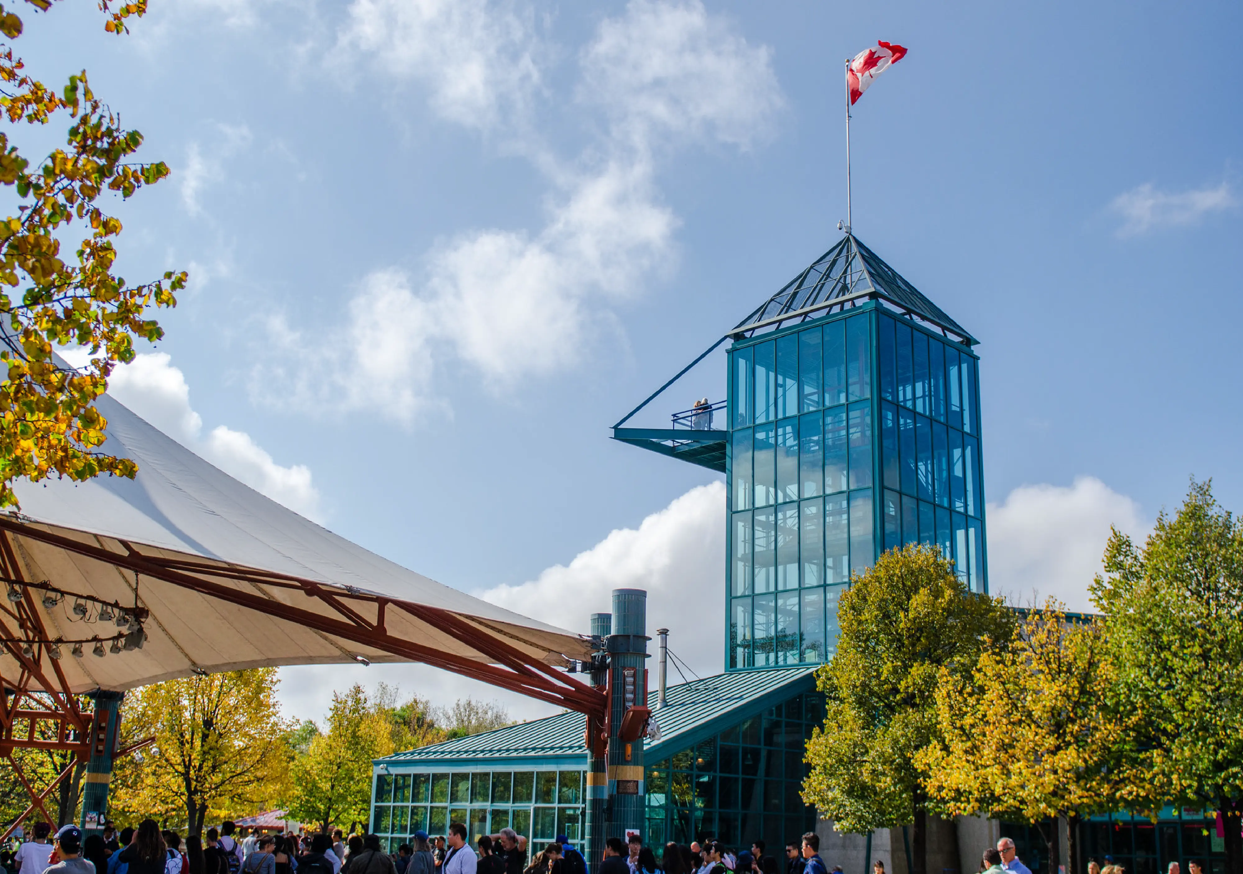
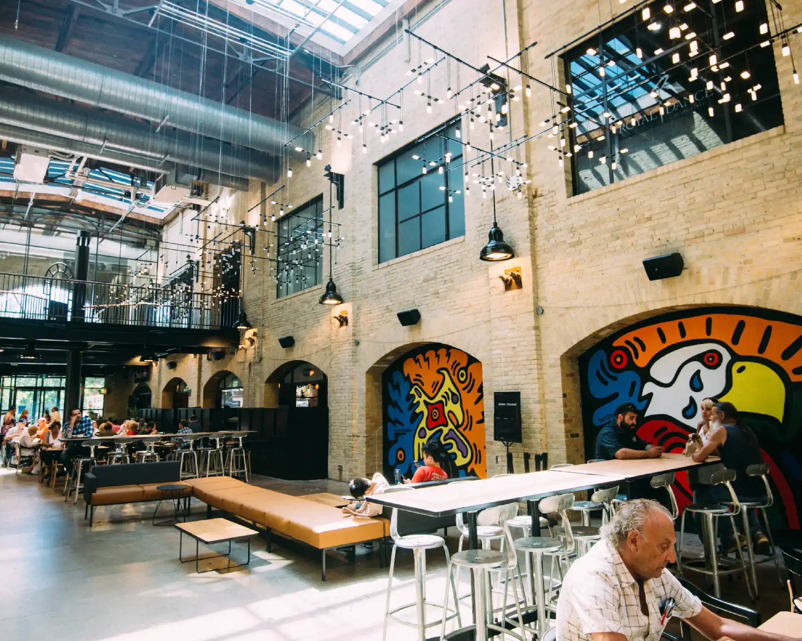
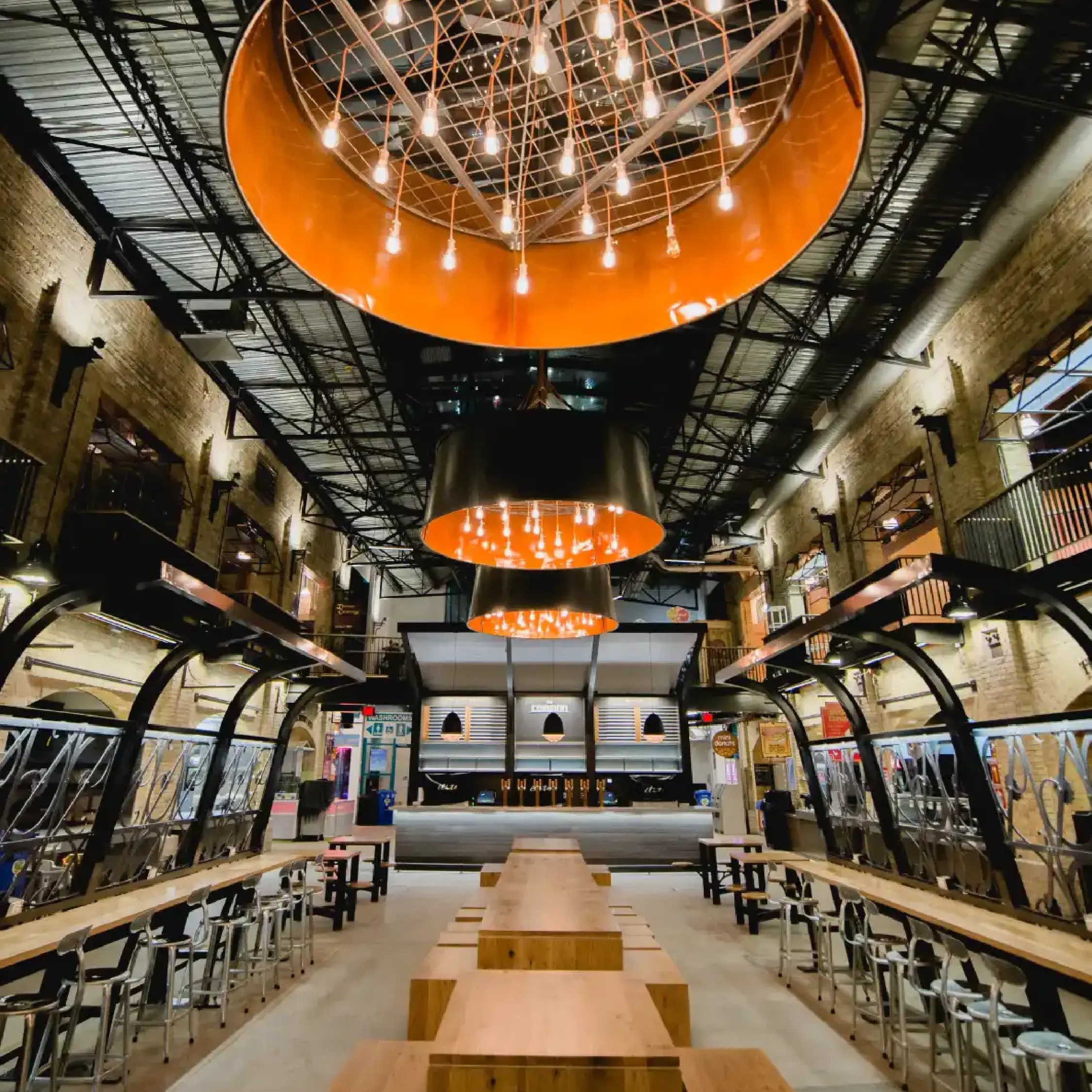
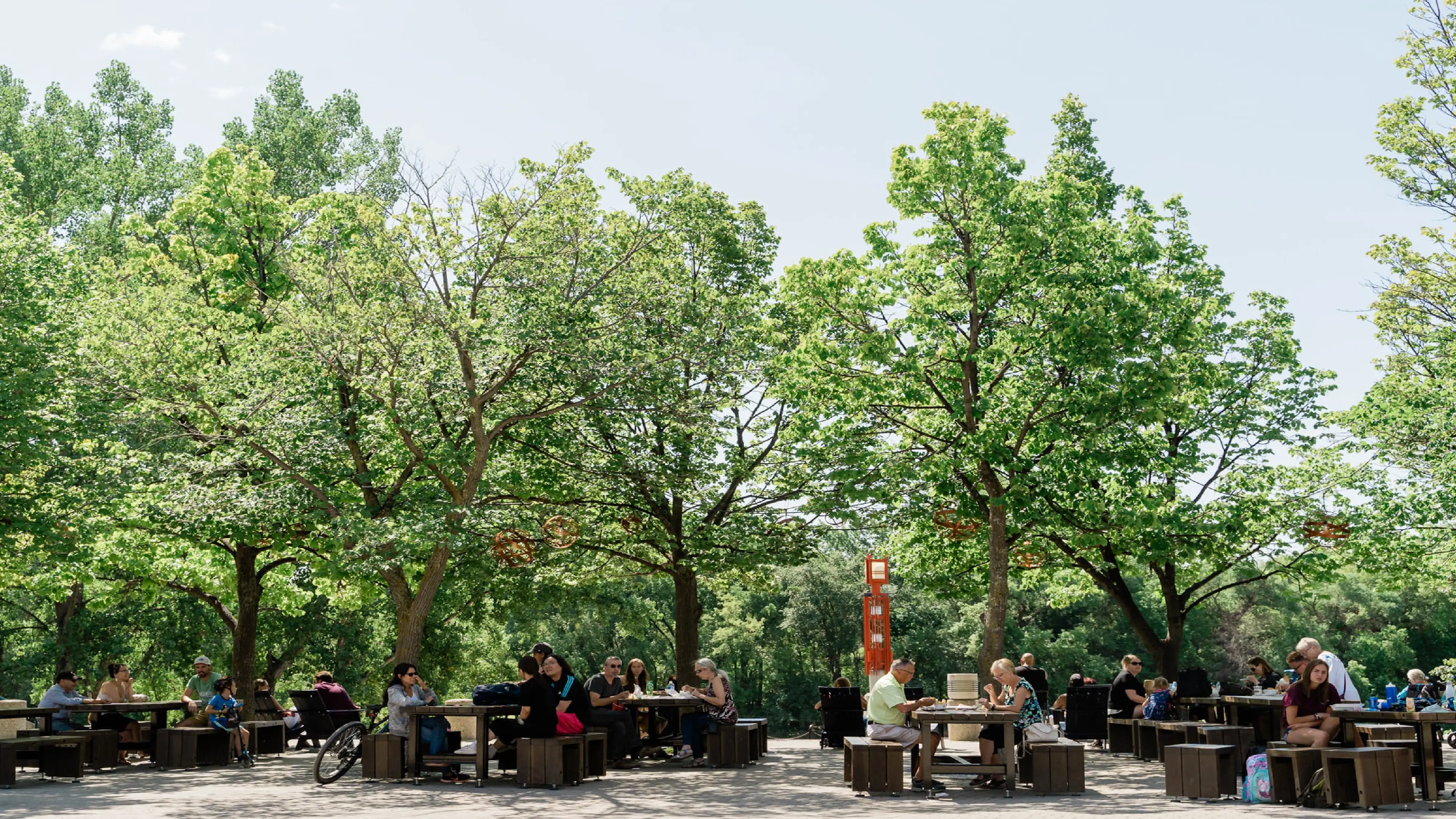
The Forks has long been Winnipeg’s gathering place and the city’s top tourist destination—a bustling riverside mix of history, Canadian culture, skating trails, markets, and murals.
But after decades of growth, the organization was managing more than a dozen brands under one umbrella: a craft beer and wine bar, a parking authority, seasonal attractions and long-term tenants, all with a major new mixed-use development on the way.


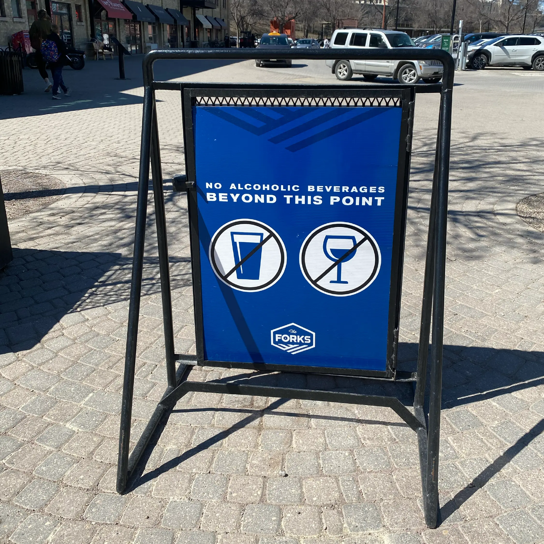
The trouble was, these sub-brands didn’t look or sound like they belonged to the same family. Signage, wayfinding, and digital touchpoints were inconsistent and weren’t always accessible. The brand story was fragmented, with different platforms telling different, and sometimes conflicting, versions.
They knew their brand story mattered, but it was getting harder and harder for them to tell it.
“I knew I needed help from an outside expert for our brand and storytelling audit because I needed a fresh, objective perspective and concrete guidance on next steps to take.”
Larissa Peck, Director of Corporate Communications
They needed an objective partner to untangle the brand architecture, pinpoint what was working, and deliver a practical, phased roadmap they could start using right away.
Over several months, we conducted a full brand audit of The Forks, combining destination branding and place-based brand strategy to develop a plan that would honour both its history and future ambitions.
“I didn't know if what I was asking for would be something Little Ghost would take on, but I knew it was worth inquiring because I knew we would be thoroughly looked after!”
Larissa Peck, Director of Corporate Communications

We began by looking back across thirty-five years of brand history, from the original vision and mission to the current strategic plans, digging deep to understand how The Forks had evolved and where it had drifted from its original intent.
We spoke with executives and team leaders across the organization, capturing both leadership perspectives and insights into how the brand was being experienced and expressed.
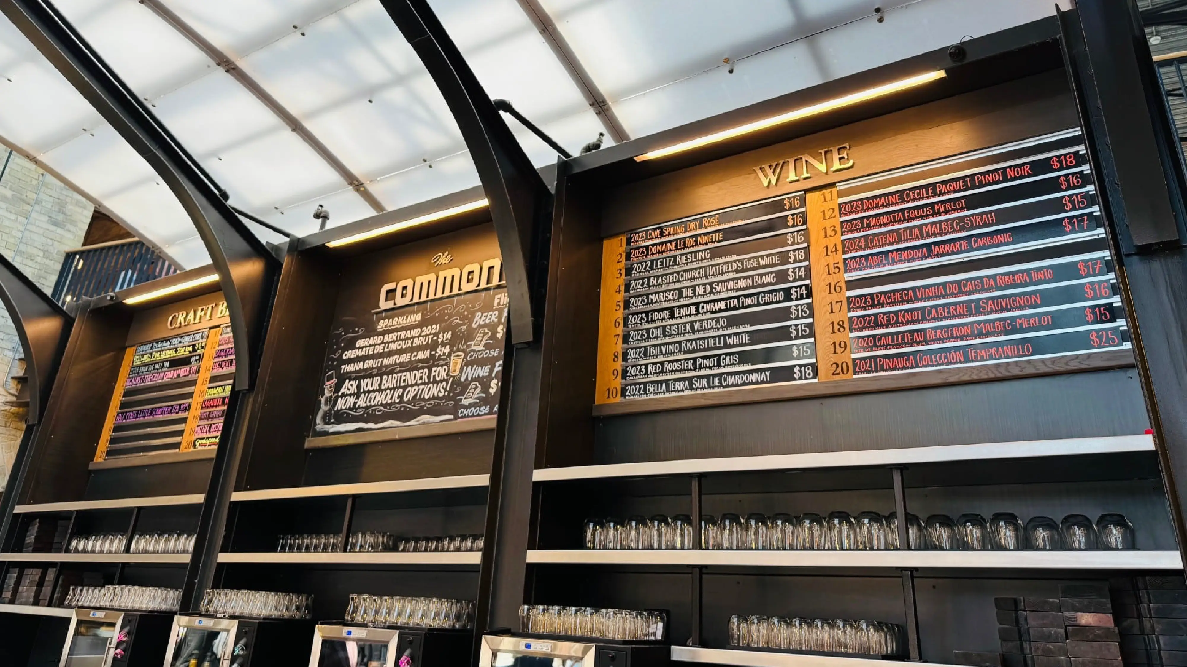
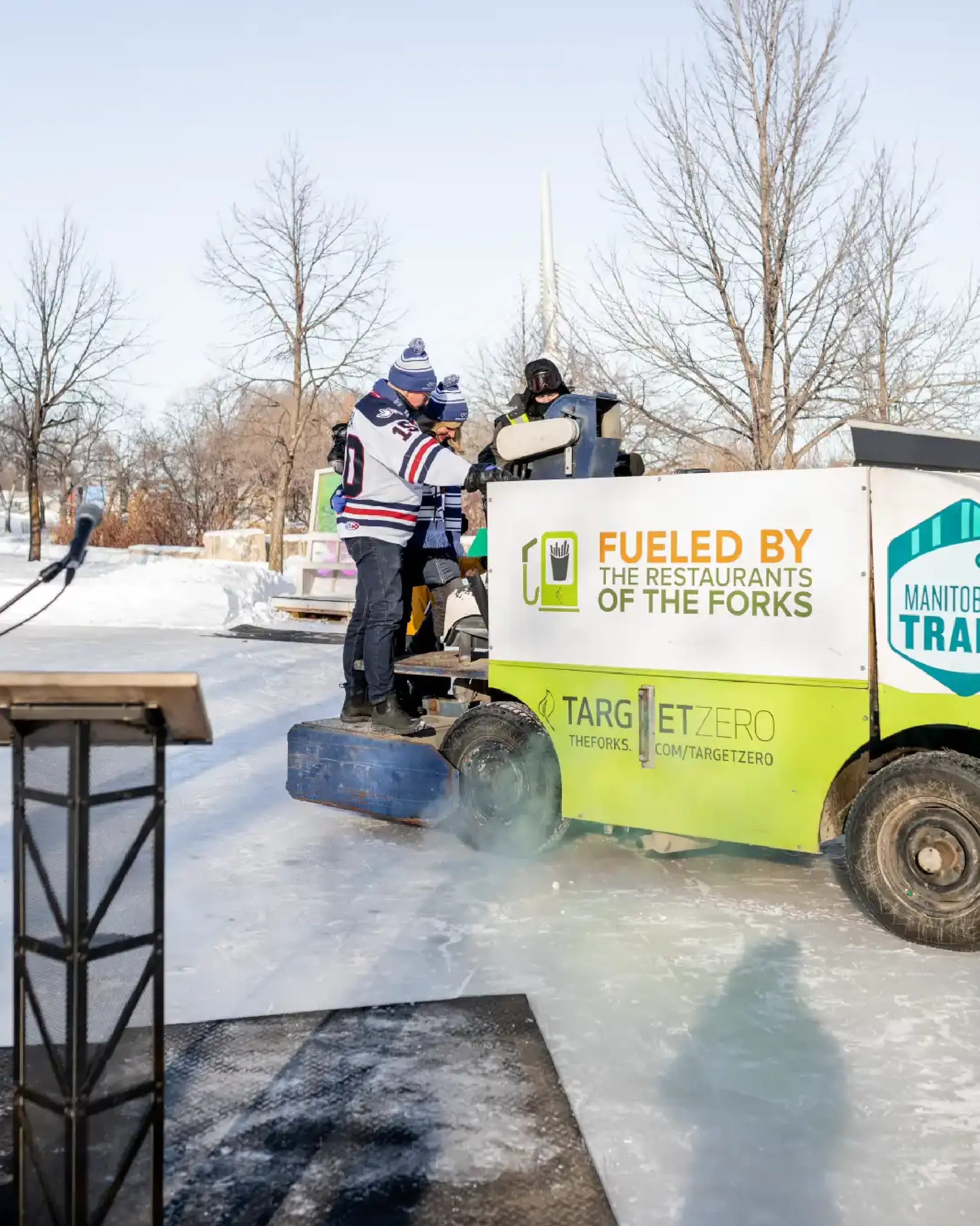
We audited each sub-brand in detail, including The Common craft beer and wine bar, FNP Parking, and upcoming projects like Railside, and assessed how well they fit into the larger brand ecosystem.
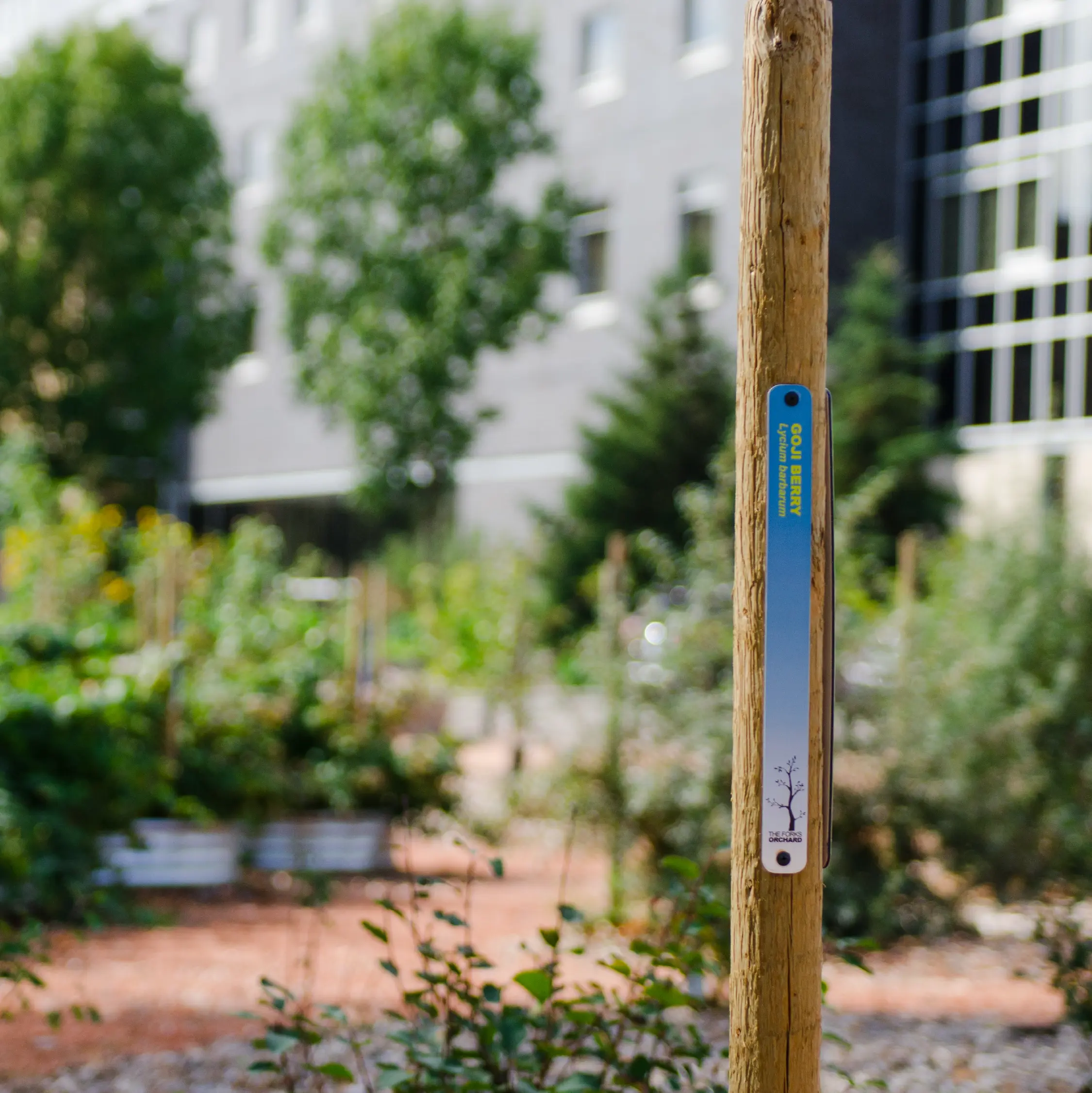
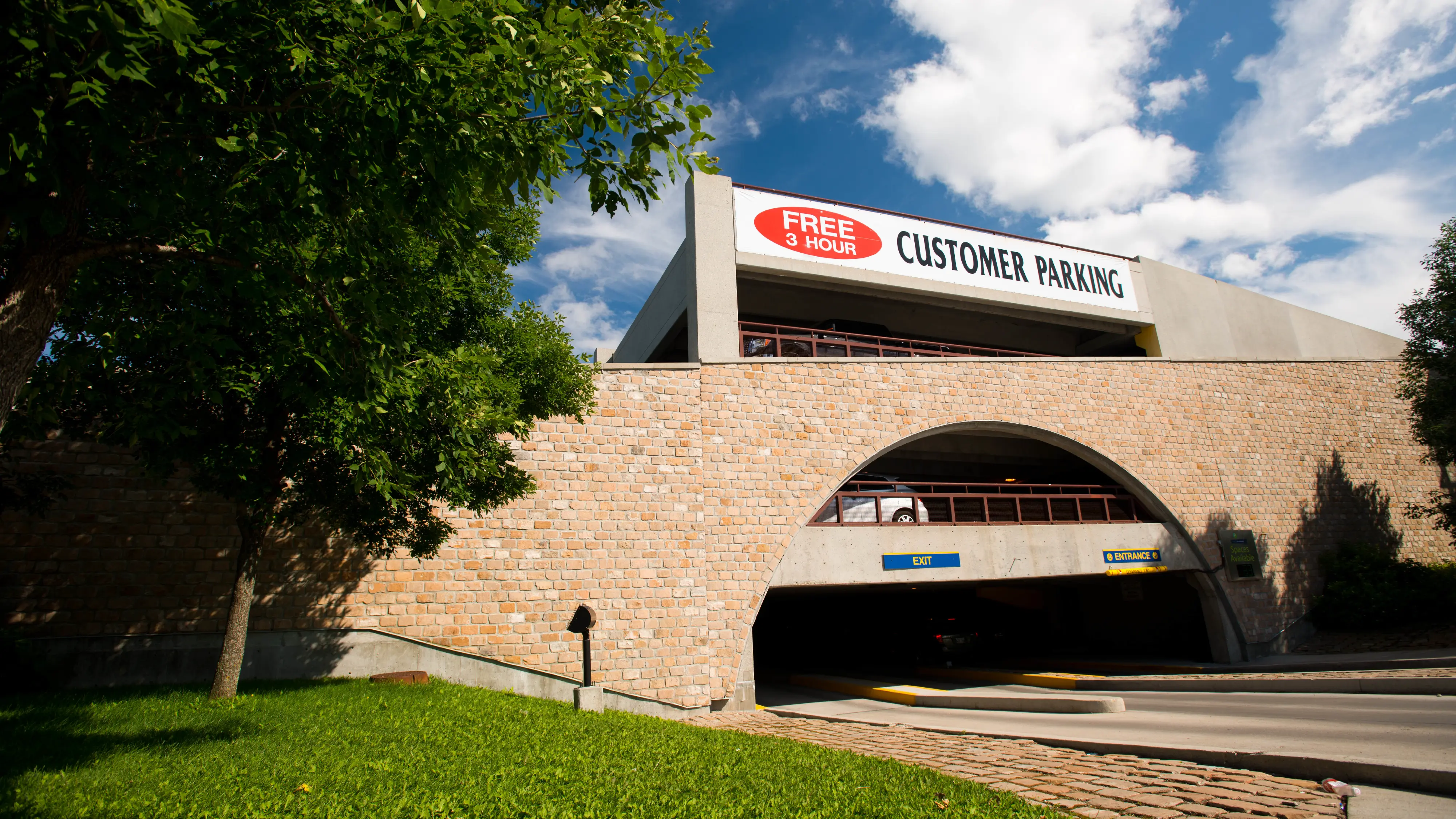
We explored the grounds of The Forks the way a visitor would, walking the paths, stepping into spaces, and seeing it through fresh eyes to find where the journey made sense and where it faltered.
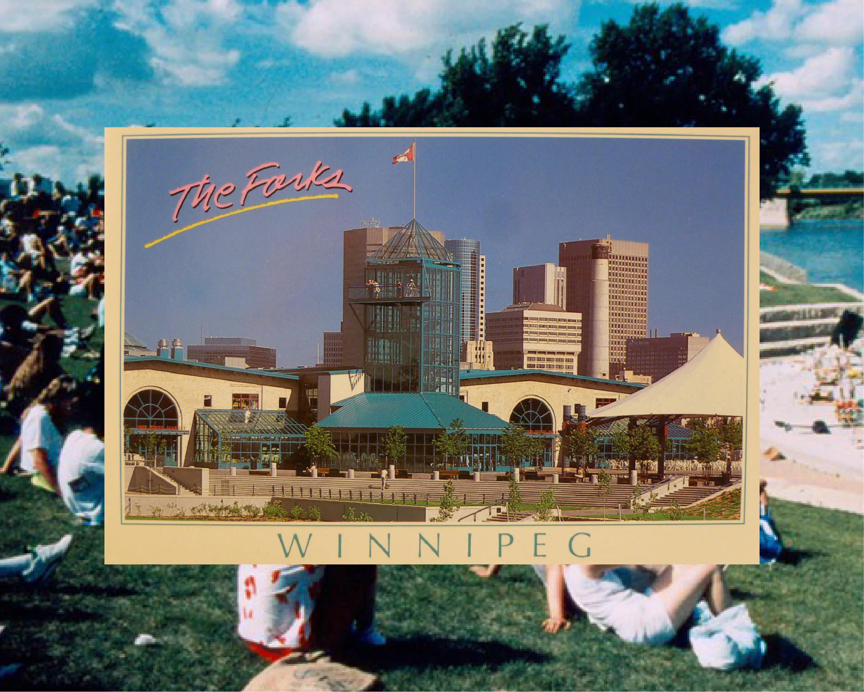
We uncovered the original brand guidelines from 1993. Decades later, traces of this original brand still appear throughout the site, quiet reminders of The Forks’ layered brand history that leave a lasting physical imprint on the visitor experience.
We identified some important points of disconnection, like outdated signage, accessibility barriers, gaps in bilingual communication, and missed opportunities for more inclusive storytelling.
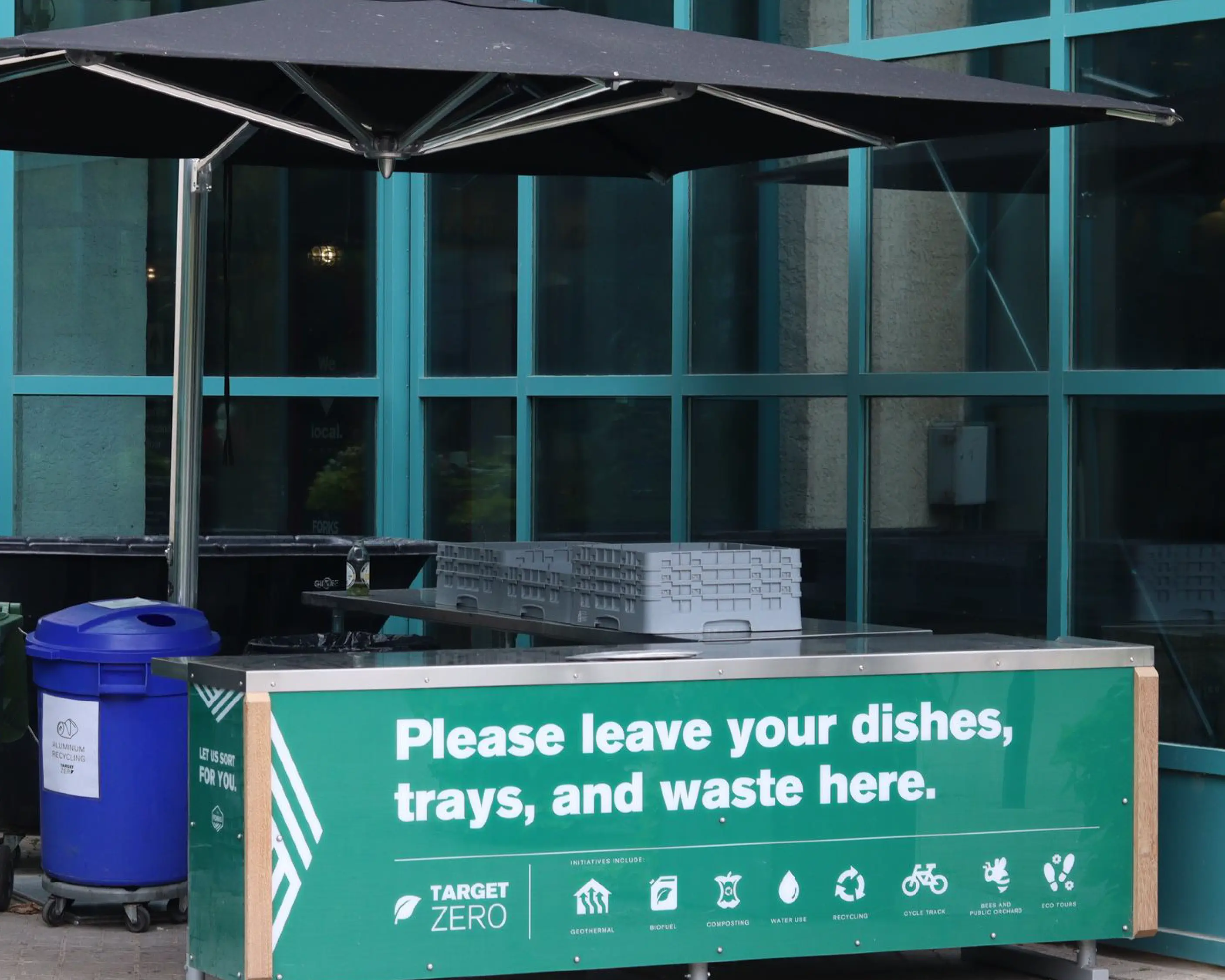
We reviewed tone, narrative, and naming across every channel, pinpointing where the brand voice was strong, where it had wandered, and where it was absent altogether. We also audited environmental and digital wayfinding, evaluating how well the physical and online experiences supported or contradicted the story that The Forks wanted to tell.
What we found was a brand that is rich in history and deeply rooted in the community, but weighed down by too much complexity. Our focus became how to make it simpler, more consistent, and easier for everyone to experience.

This included identifying which sub-brands could be retired or absorbed under The Forks master brand, which deserved distinct identities of their own, and which needed renaming to better reflect their purpose.
We clarified the hierarchy between The Forks, its signature destinations like The Common, and service entities like FNP Parking, defining how each should communicate, when to lead with The Forks name, and how to share visual and verbal cues to create cohesion.
By the end of the process, The Forks had something they hadn’t had in years: a clear, shared understanding of who they were, where they were going, and how to get there.
“The thorough presentations combined with short executive summaries were key for us.”
Larissa Peck, Director of Corporate Communications
Internally, our work helped align the team and gave them confidence in their story; externally, it set the stage for a fresh rebrand that will carry them through the launch of Railside at The Forks and beyond.
After the RFP, The Forks returned to us as a strategic consultant to review the new branding proposed by a local agency. Acting as their brand stewards, we evaluated the creative work against the strategy we had developed, providing feedback to ensure the new identity remained true to the brand’s core purpose, architecture, and accessibility goals.

To support the rebrand rollout, we built a detailed brand touchpoint spreadsheet cataloguing every touchpoint across the site—from signage and menus to digital platforms and staff uniforms—outlining which elements should be redesigned or retired for a cohesive brand launch.
This project proved that destination branding for cultural landmarks must start with a strategy to align the past, present, and future into one clear story that connects the place to the people who love it.
“I've had the chance to work with Robyn in various capacities over the years and always been very impressed with her level of organization, professionalism, confidence and ability to pull together just the right team to fulfill a project.”
Larissa Peck, Director of Corporate Communications
We can help you find your story and build a clear plan to carry it forward.
Photography has been generously provided by The Forks Renewal Corp.


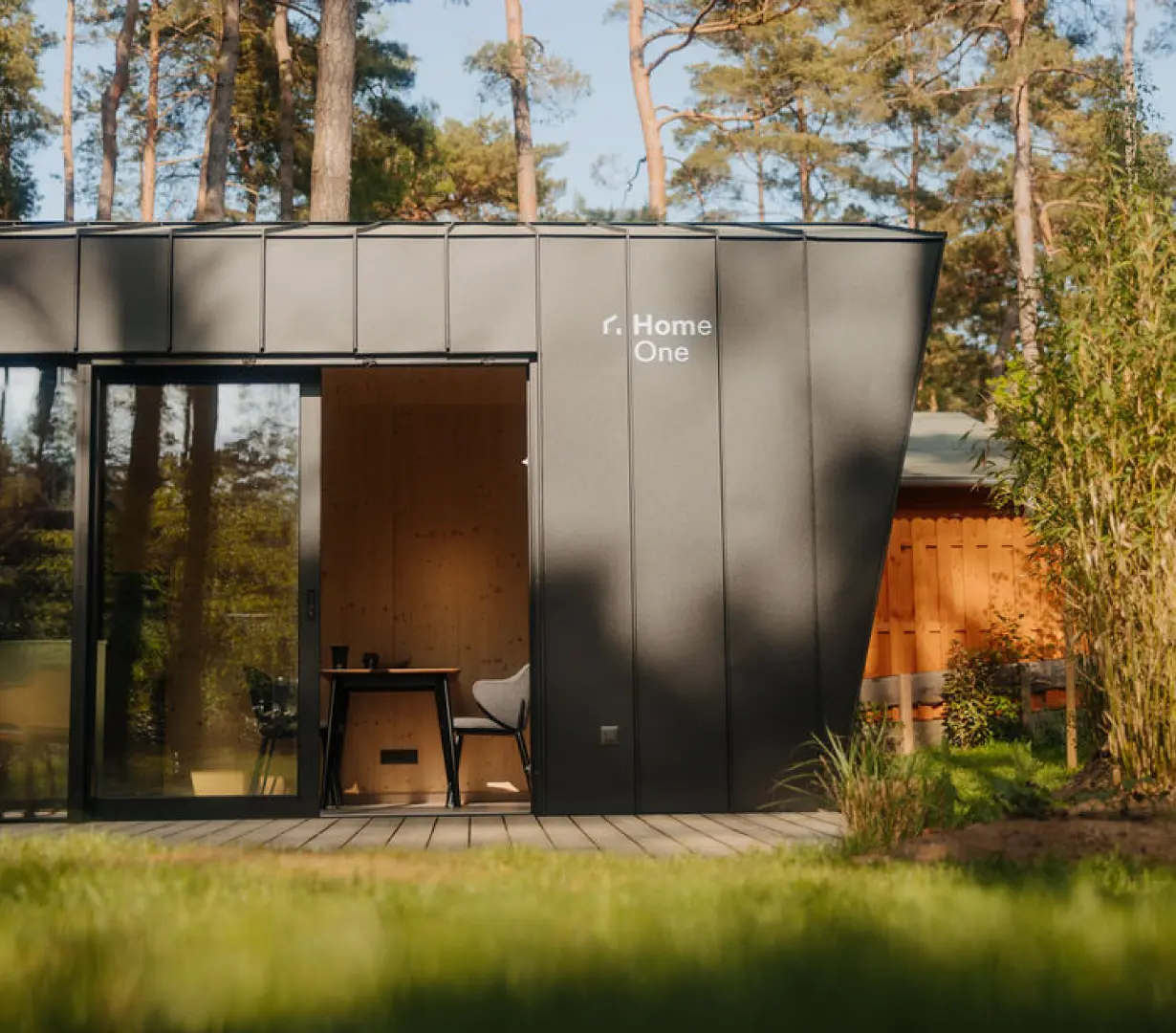
How we helped Germany’s Home One evolve into a brand that reflects their full vision—scalable, sustainable homes and hospitality partnerships with minimalist design and care for the planet.