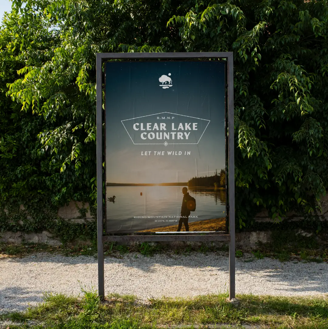
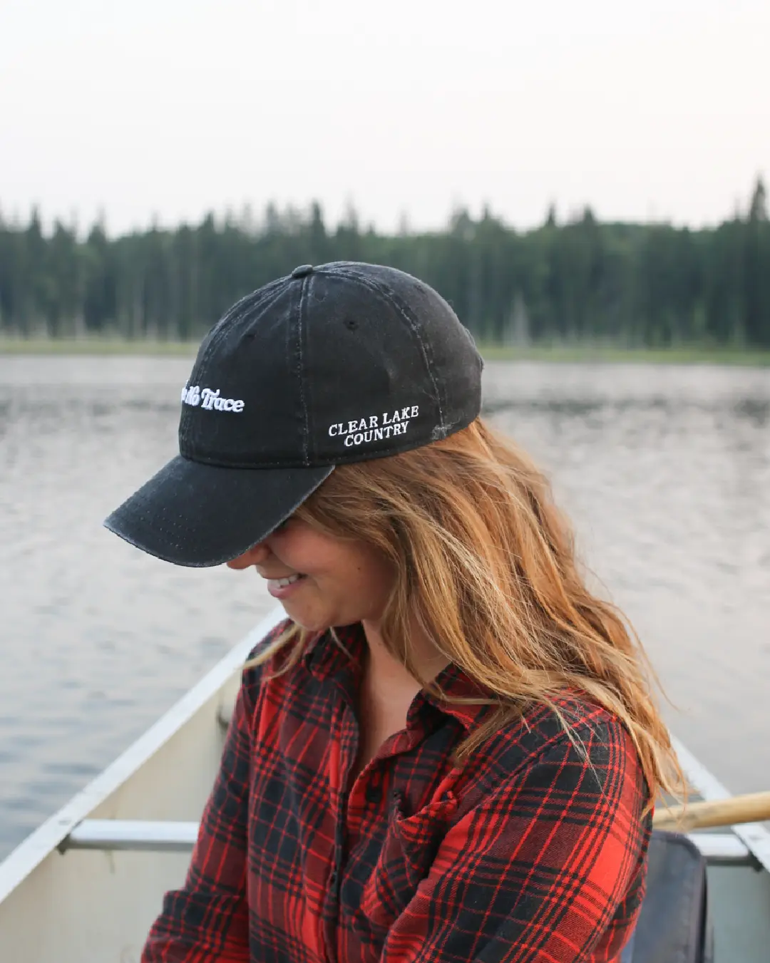
By 2024, their brand identity had been in use for nearly a decade. It had served them well, but it no longer reflected the adventurous, modern energy of the place—or the millennial travellers they wanted to reach.
They needed a visual identity that felt wilder, more character-rich, and more in tune with their new tagline: Let the Wild In.
Their agency partner came to us at a high-stakes moment. After three unsuccessful attempts at a visual identity, they were looking for a “Hail Mary”—something that could finally capture the essence of the place.