Mino Kanawapamin
Brand Identity for an Indigenous Land-Based Knowledge Centre
How Little Ghost created an adaptable identity that honours culture and community—bridging ancestral wisdom and contemporary design.
How Little Ghost created an adaptable identity that honours culture and community—bridging ancestral wisdom and contemporary design.
Our Mission
Category
Location

Mino Kanawapamin, meaning “Look at me in a good way,” is an Indigenous-led land-based education program in Manitoba rooted in reconnection, identity, and community care.
Designed to reveal the gifts and power within Indigenous children, youth, and families, the program returns learning to its first classroom: the land.
By focusing on land-based education, Mino Kanawapamin is helping restore traditional knowledge that has been diminished through colonization and the impact of residential schools.
Its vision also reaches outward, creating space for dialogue between Indigenous and non-Indigenous communities, fostering mutual respect, and returning to the original purpose of prospering together as treaty people in Canada.
“Our goal is to foster a positive understanding of indigenous peoples and their generous contribution to the creation of Canada through Treaty.”
Patrick Thomas, Mino Kanawapamin Founding Member
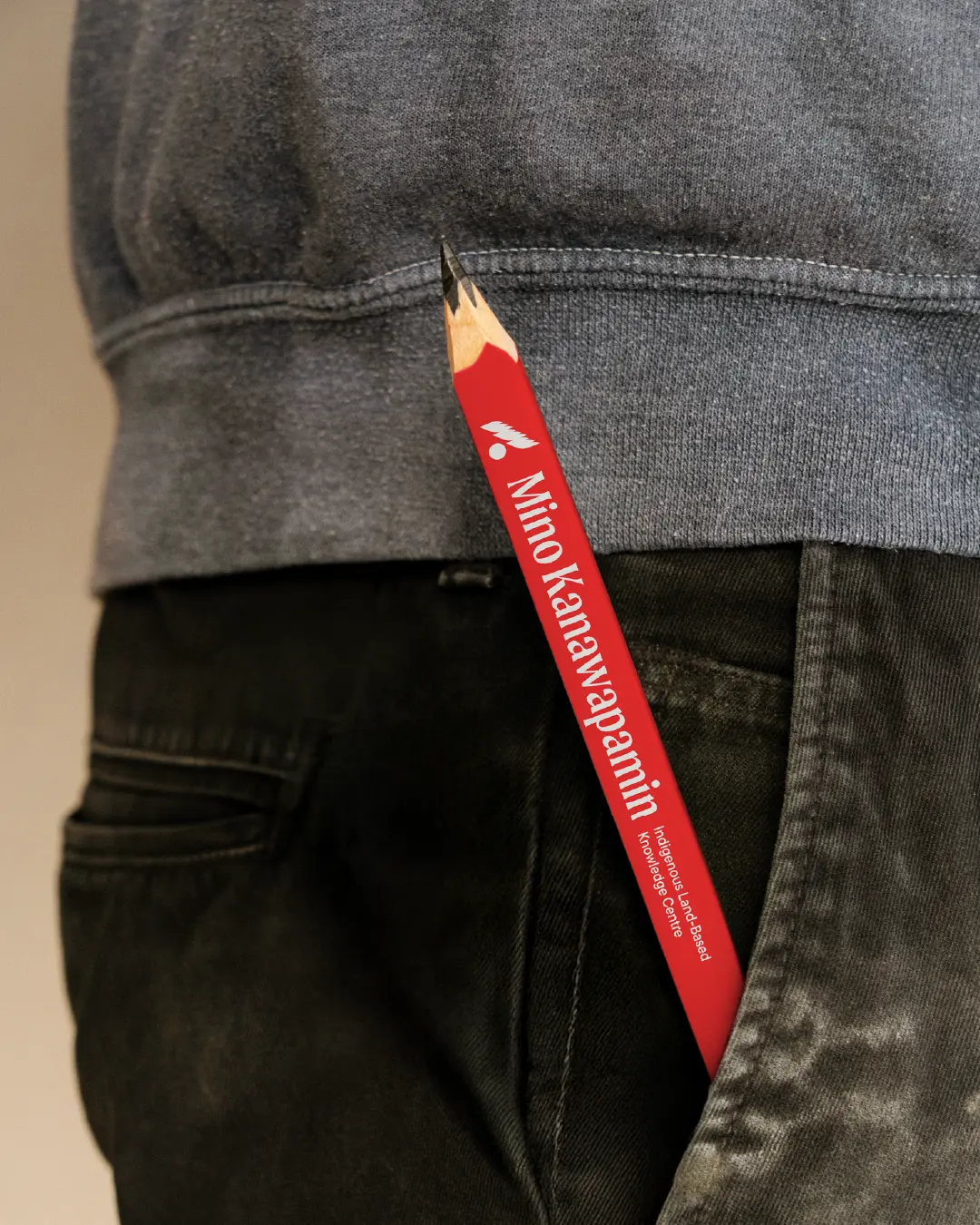
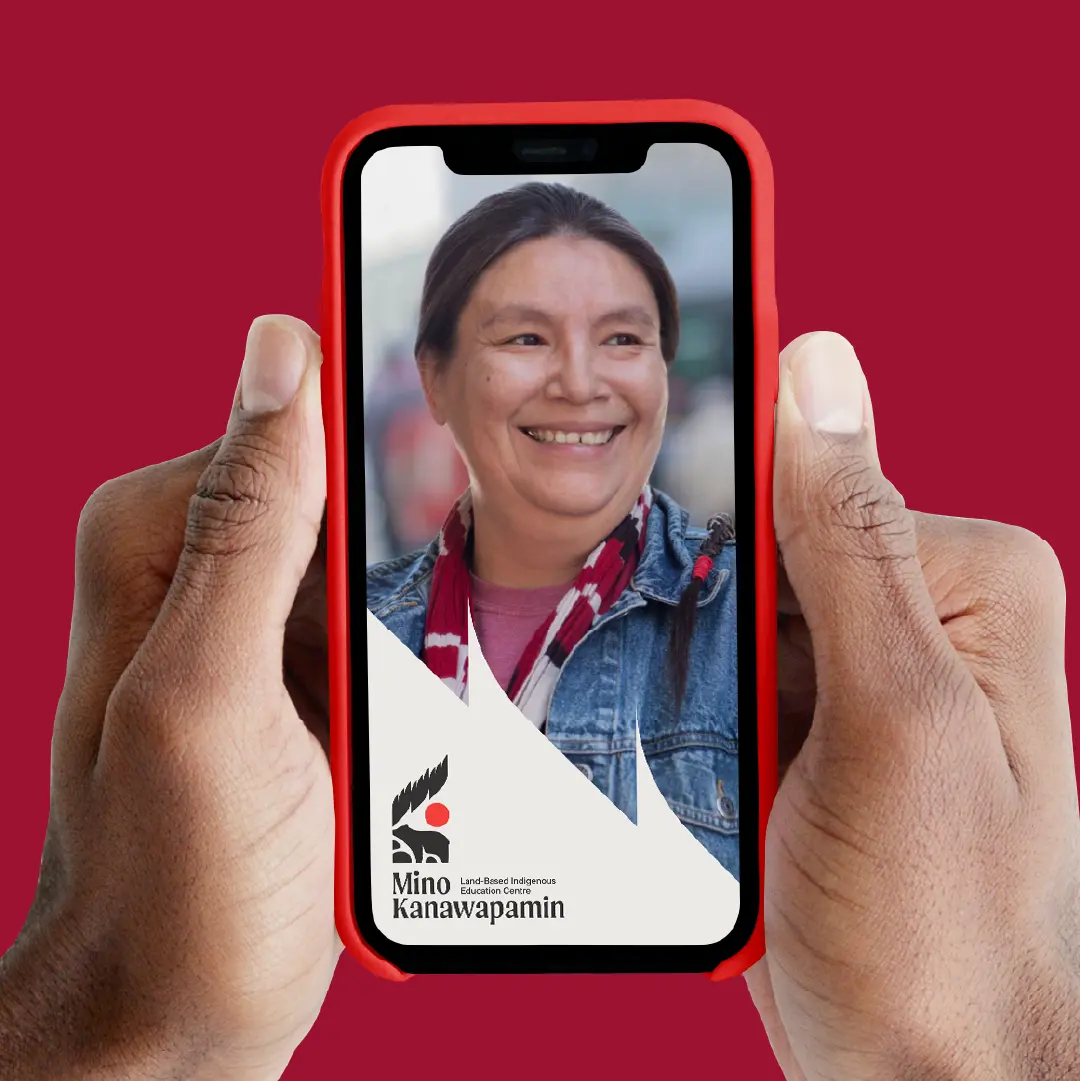
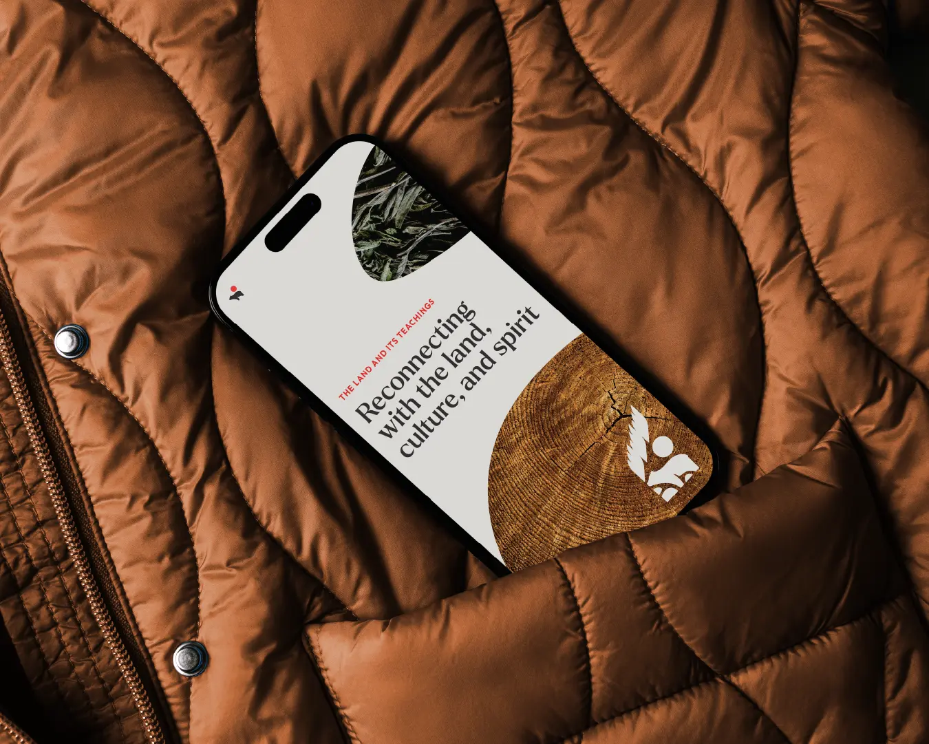
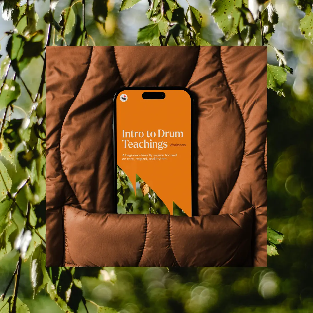
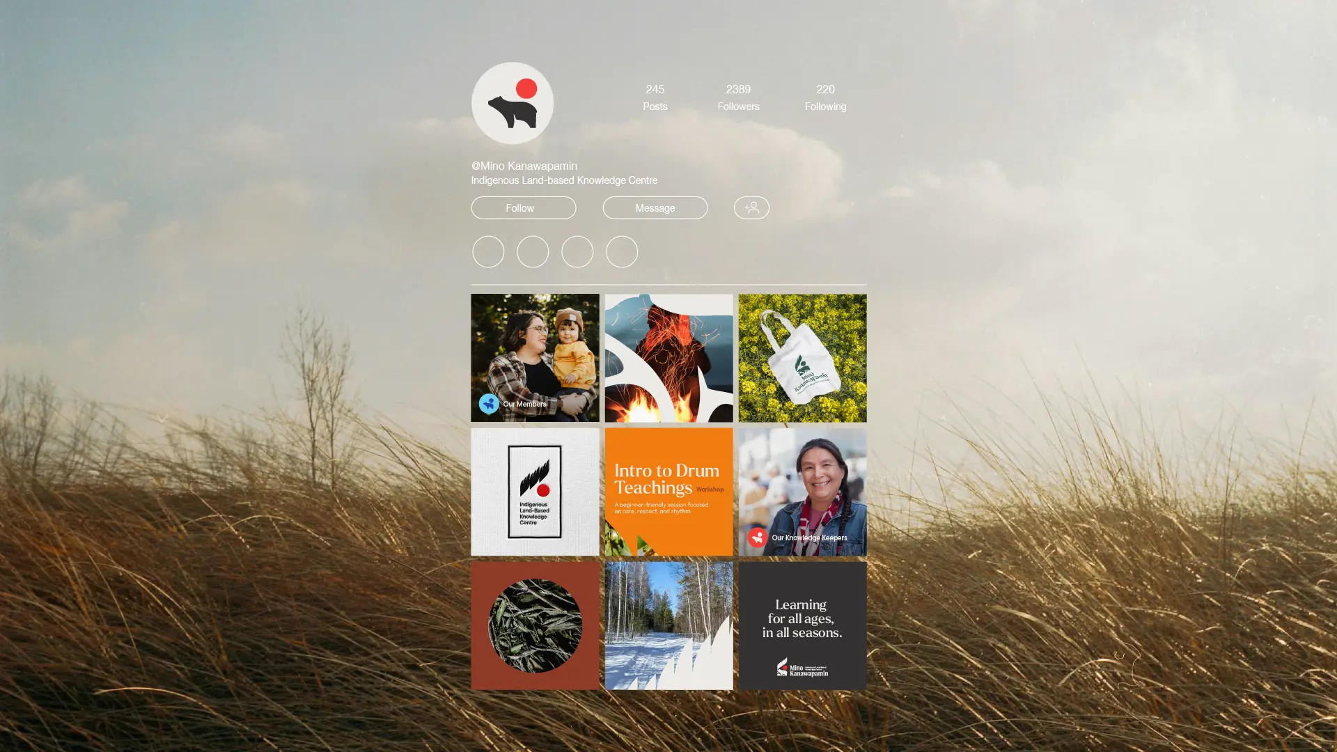
The team wanted a brand that could grow with the centre: grounded, respectful, and recognizable across signage, digital platforms, and learning materials.
They came to Little Ghost seeking an approach shaped by care. They wanted to avoid symbols that felt generic or disconnected from their teachings.
Our team approached the work with respect, taking time to understand the meaning behind the name “Mino Kanawapamin” and the teachings that would guide the centre.
They shared their vision with us: a place where education is rooted in land and language, where Elders and Knowledge Keepers guide learning, and where every visual touchpoint supports that purpose.
“It’s about restoring that knowledge that has been lost.”
Patrick Thomas, Mino Kanawapamin Founding Member
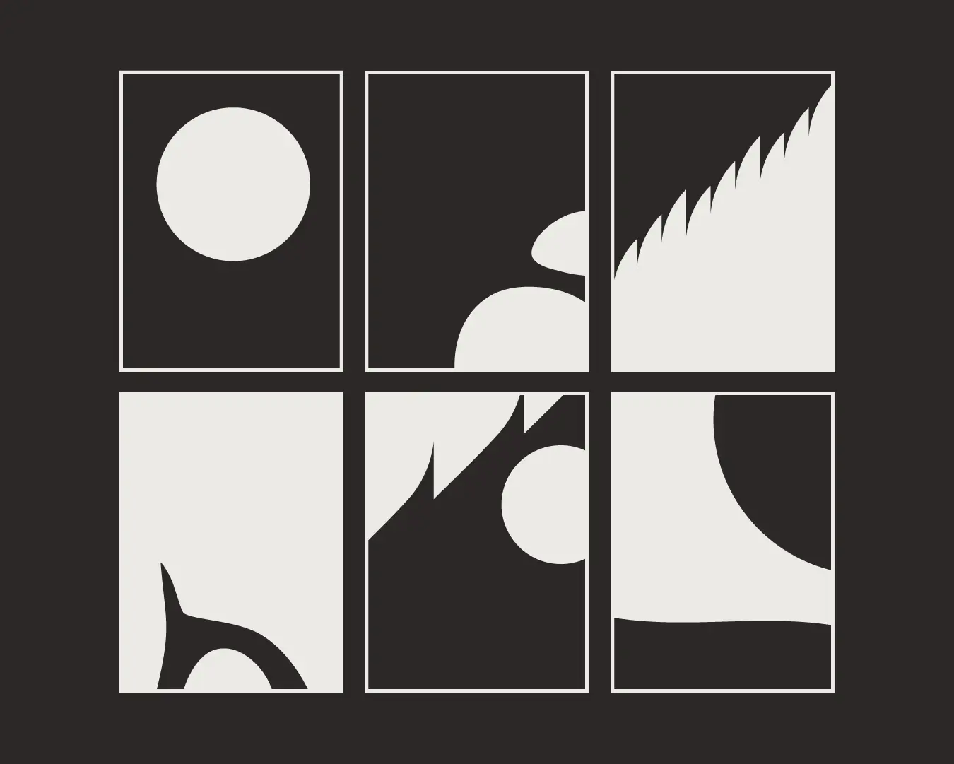
Rather than relying on abstract symbols, the direction came from the land itself: its colours, forms, and cycles.
We also drew inspiration from woodland artwork created by the client’s family members, a visual language built on symbolism, story, and spirit.
The challenge was to balance cultural grounding with practical usability. Mino Kanawapamin needed a brand strong enough for wayfinding and program materials, but gentle enough not to overshadow the community voices at its core.
The resulting direction draws inspiration from Woodland Art, blending traditional Indigenous visual language with modern design sensibilities. It’s vibrant, empowered, and rooted in the land, reflecting the program’s mission to reconnect with culture and identity.
The aesthetic celebrates boldness, not just in colour, but in voice, creating a bridge between ancestral wisdom and contemporary expression.
The logo and supporting graphics are based on the idea of seeing in a good way and walking forward together, a visual interpretation of the name Mino Kanawapamin.
Within the mark, the teachings are layered with care:
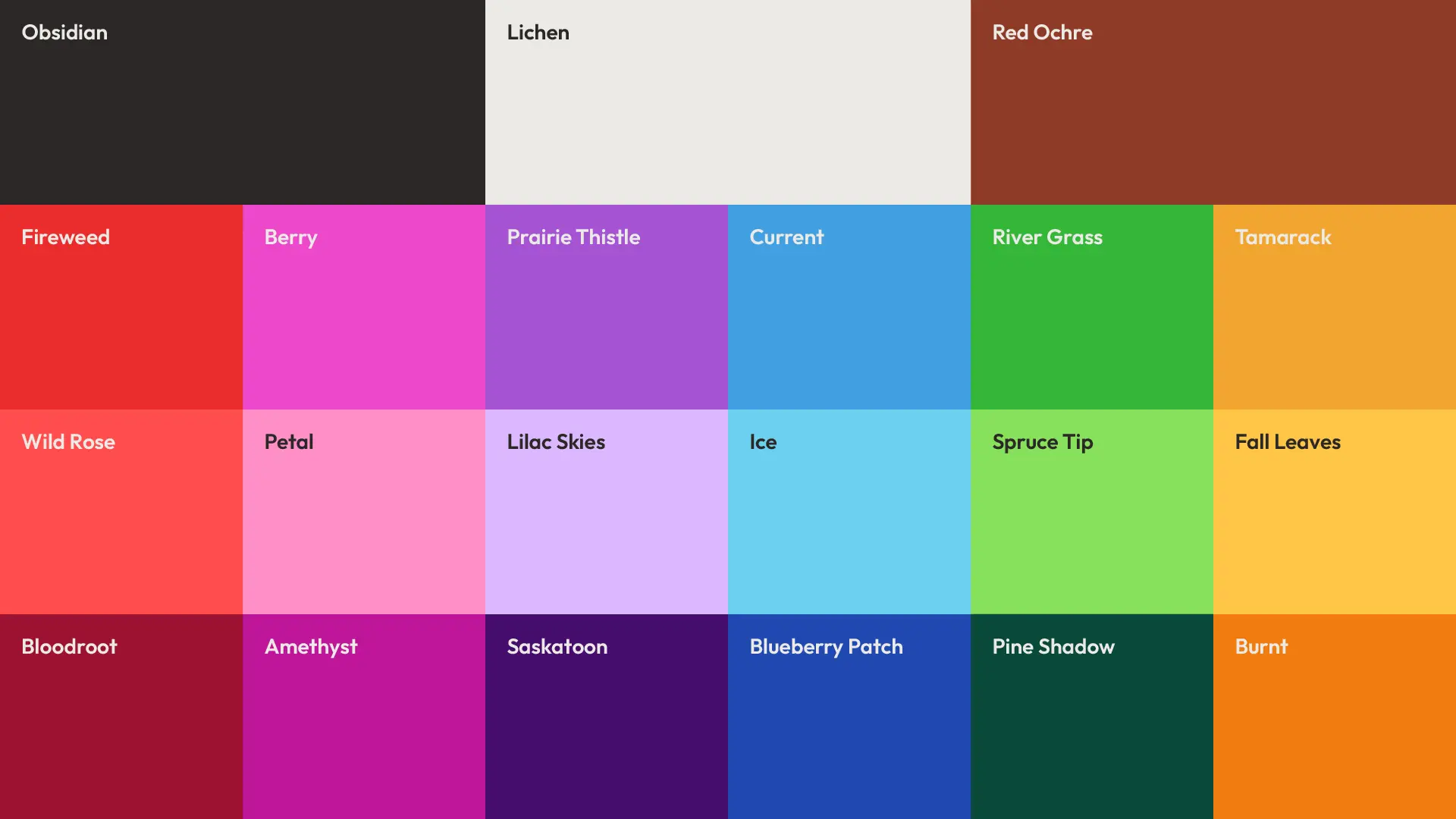
The colour palette draws from the founder's spirit name, the land surrounding the future site and from land-based medicines.
Together, the colours anchor the identity in place and spirit while remaining practical across digital and print applications.
“When I received [my] spirit name it came with colours. The primary colour is red, and then the two colours that go along with it are blue and orange.”
Patrick Thomas, Mino Kanawapamin Founding Member
Although the physical space is still emerging, the brand is ready. The completed identity provides a strong visual and strategic foundation for everything ahead—program materials, signage, community outreach, and future digital platforms.
The system gives the organization a cohesive, culturally aligned starting point that will grow as the centre grows.
This project is a reminder of the responsibility that comes with designing for Indigenous organizations. Good design begins with listening, takes its direction from community voices, and holds space for teachings that have existed long before the work begins.


We approach the work with care, respect, and collaboration every step of the way.
Robyn Kacperski — Brand Strategy & Visual Identity


How we repositioned Perch Bay as a quietly special Kenora destination, building a brand system and website that could support outdoor adventure, weddings, and year-round stays without losing its down-to-earth character.